
Impact
+20% page usage
Impact
+20% page usage
Role
Full Time Product Designer
Team
Product Manager, Engineering, Student Success Team (Account Management Team)
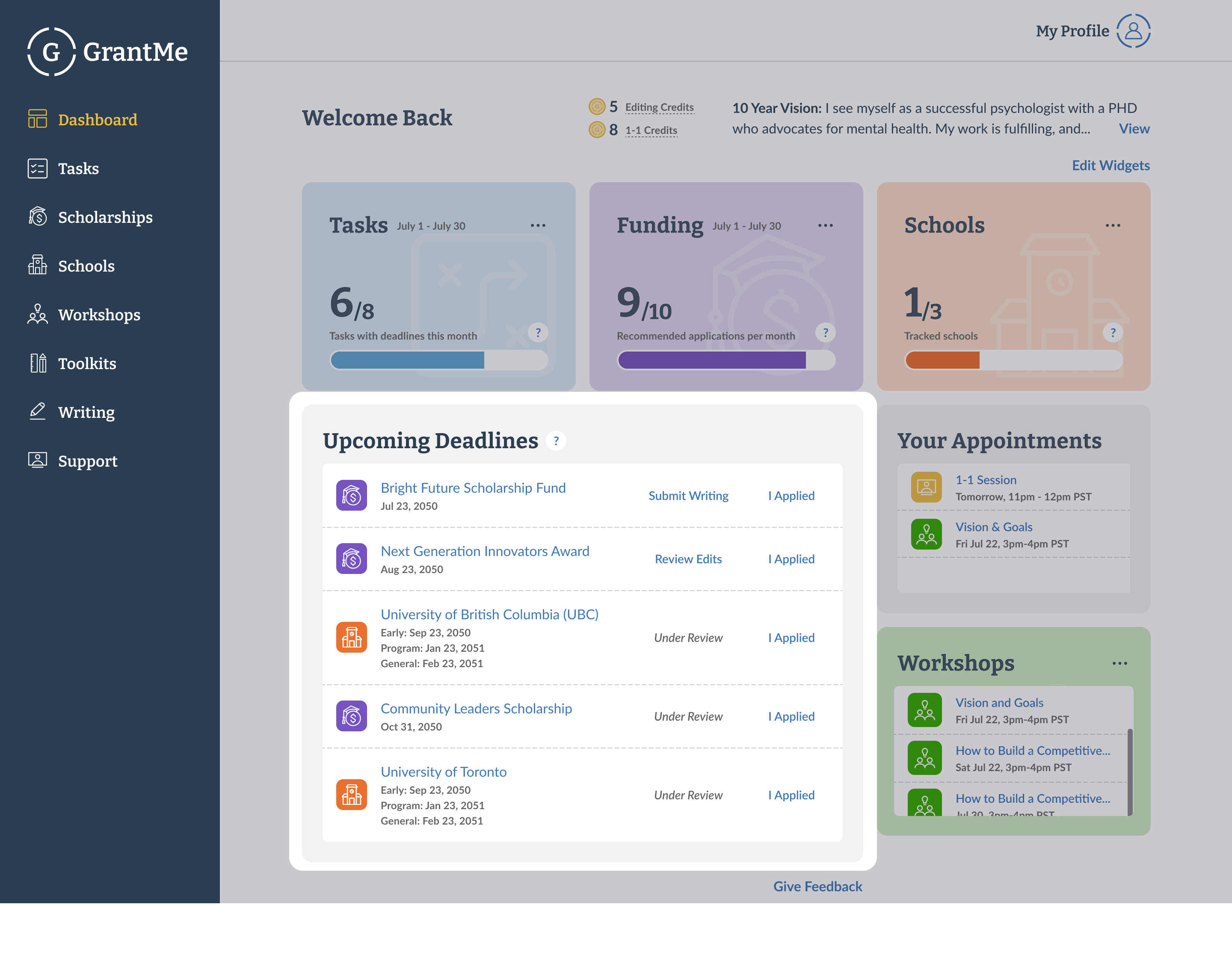
Our engineering manager came to us one day and said he hated the home page dashboard. We knew this page had its issues, so when the time came, we looked into if it was bothering our users as deeply as it was our engineering manager.
Sure enough, we verified that our students were missing out on key actions.
Looking into user heatmap data and other research, we saw some conflicting data.
Most users that visited the dashboard did not interact with it
The dashboard was the most viewed page on our platform
Only 9% of students (users) that visited the dashboard clicked on it. The dashboard guides students to achieving their goals with our product,
it's role includes driving attention to things that need action, such as upcoming deadlines.
A low engagement rate means our students are missing out on key actions, and we are failing to deliver value.
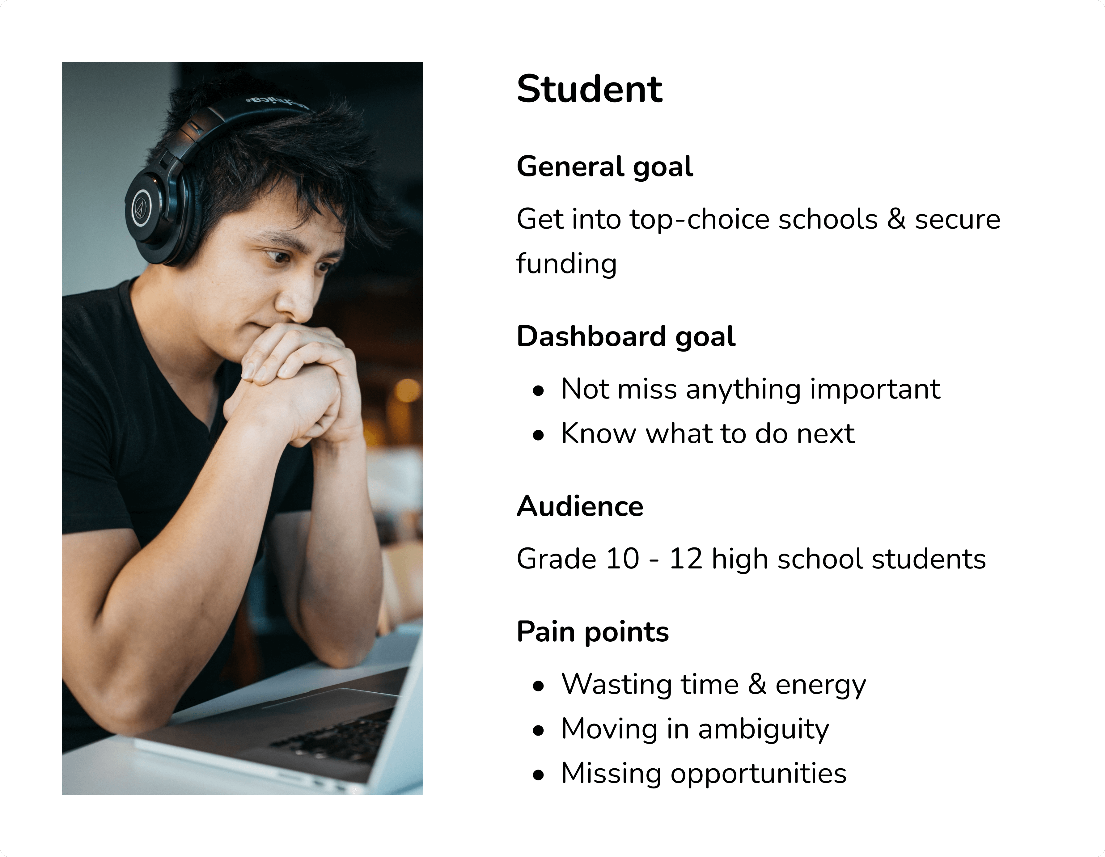
University preparation is a huge deal to students. We knew this, but we were missing how this translated into their dashboard. I designed surveys, ran interviews, and analyzing recordings to understand their thoughts.
After learning about them, I also took their priorities into a matrix and discussed it further with our devs below.
We had limited developer resources so I worked with the Engineering manager and developer team to prioritize which user flows to build for.
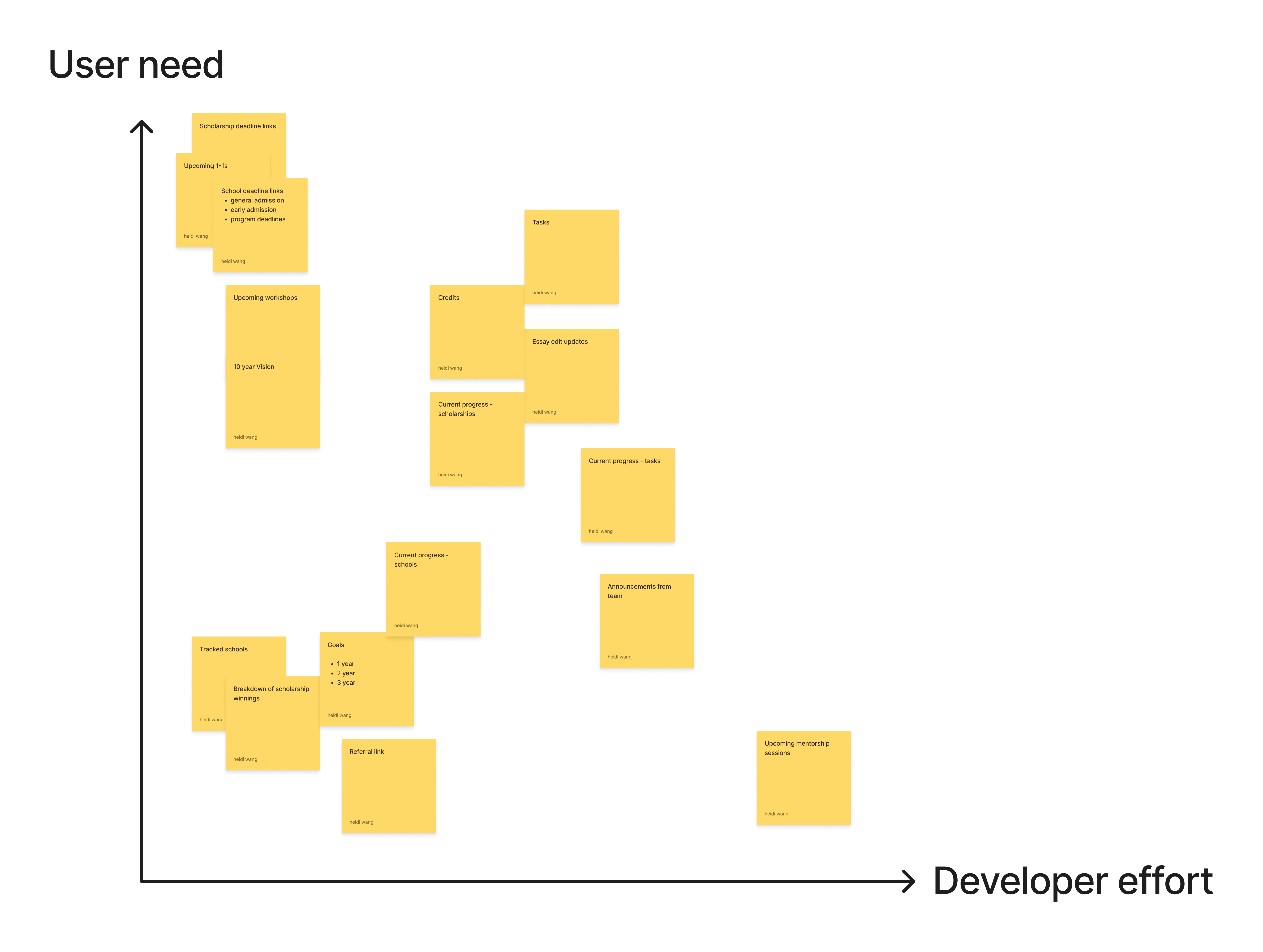
Important items for students
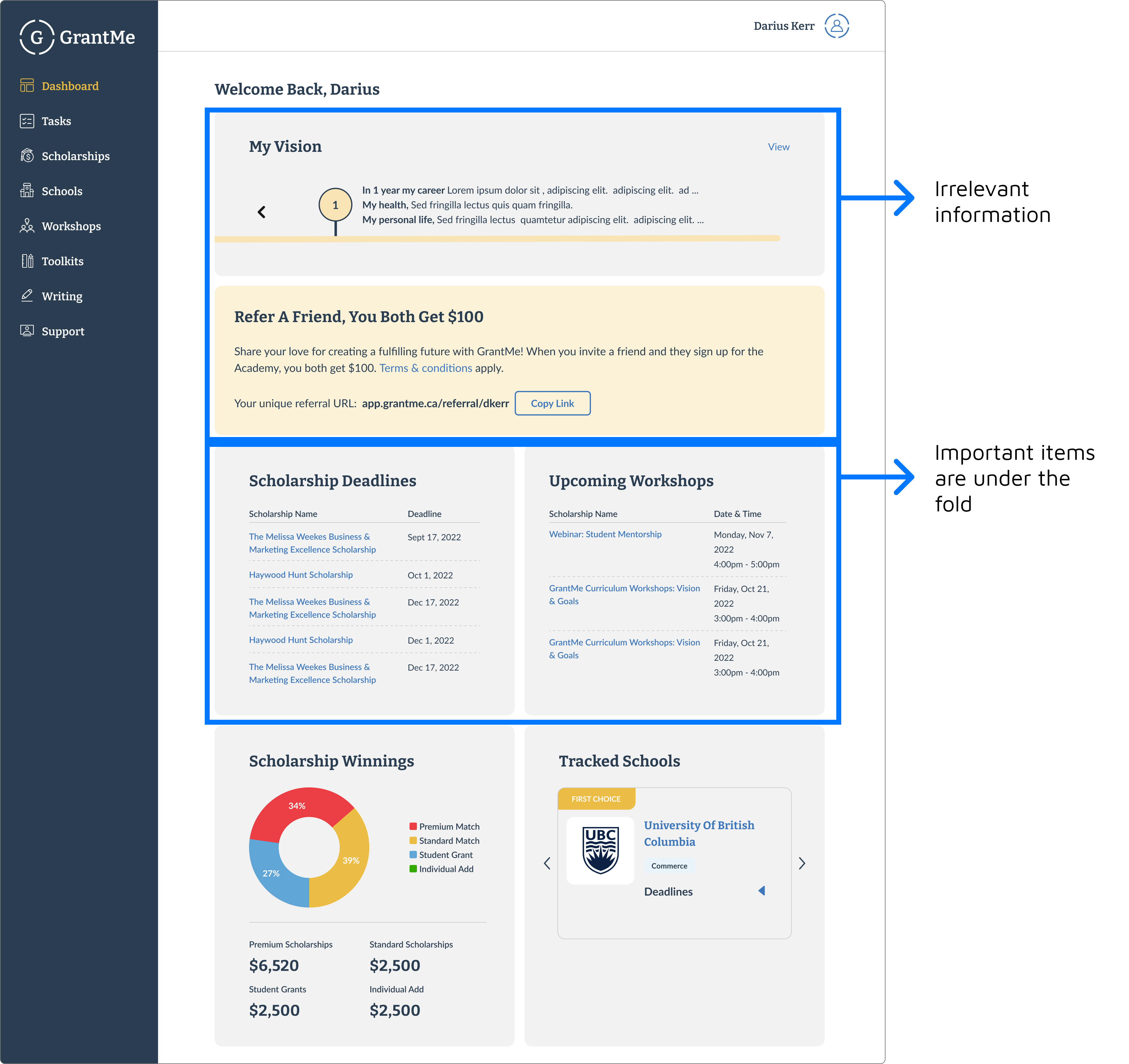
The current dashboard hid important items from our students, resulting in key opportunities being missed.
Insights
How might we help students take action on their next best course of action?
Dashboards are typically a place with lots of information. We wanted success to include higher engagement but also ensure our students weren't getting overwhelmed.
Goal metrics
Students don't know how to achieve their goal, but they look to our SAM team (an internal team of Education Consultants) to guide them. So I initiated ideation and design review sessions with this team, along with online research, to understand what I need to bring to the dashboard.
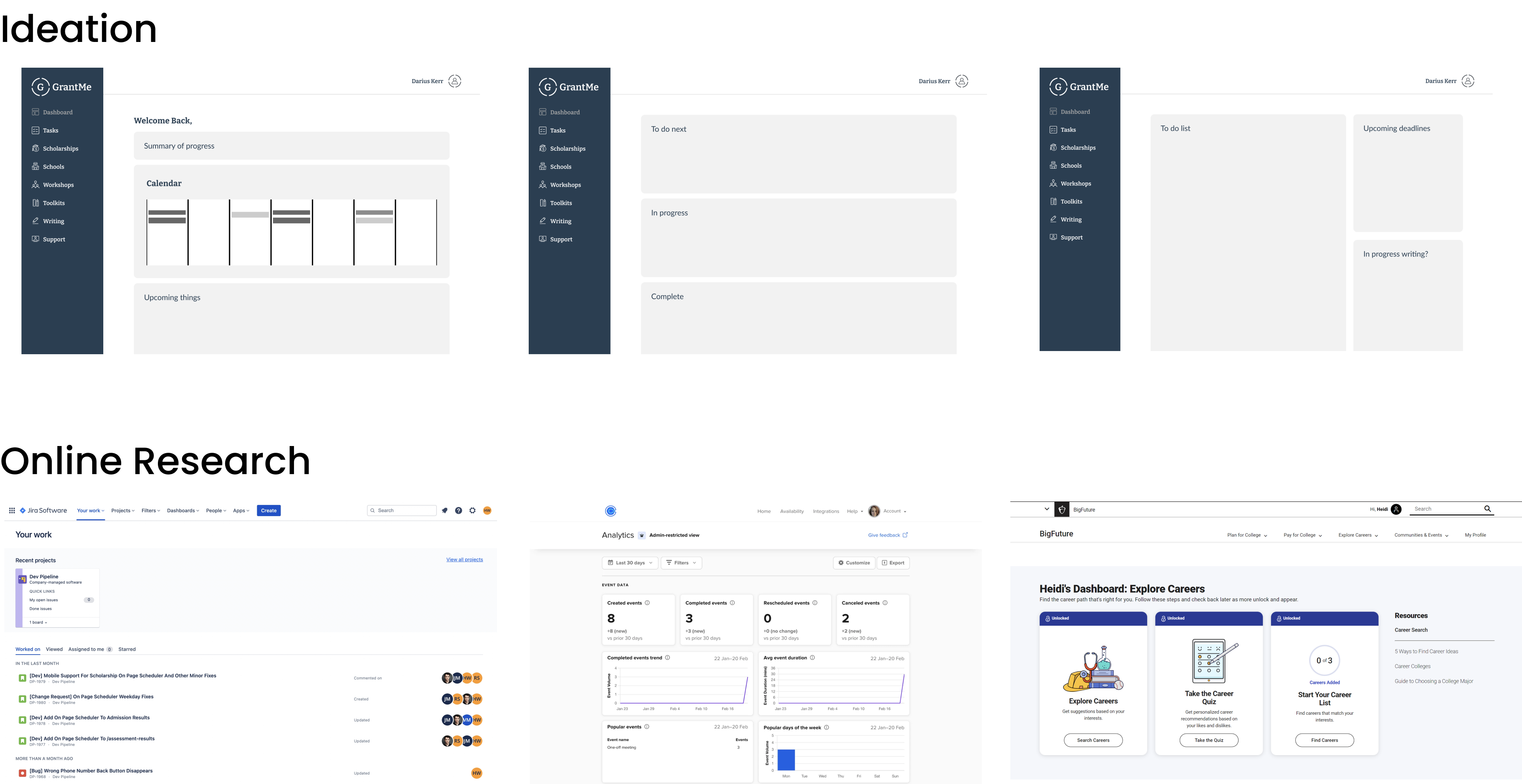
Insights
I iterated on mid-fi wireframes to help determine what general elements to have on the dashboard, then moved to hi-fi when I needed more detailed testing insights from non-product team members and users.
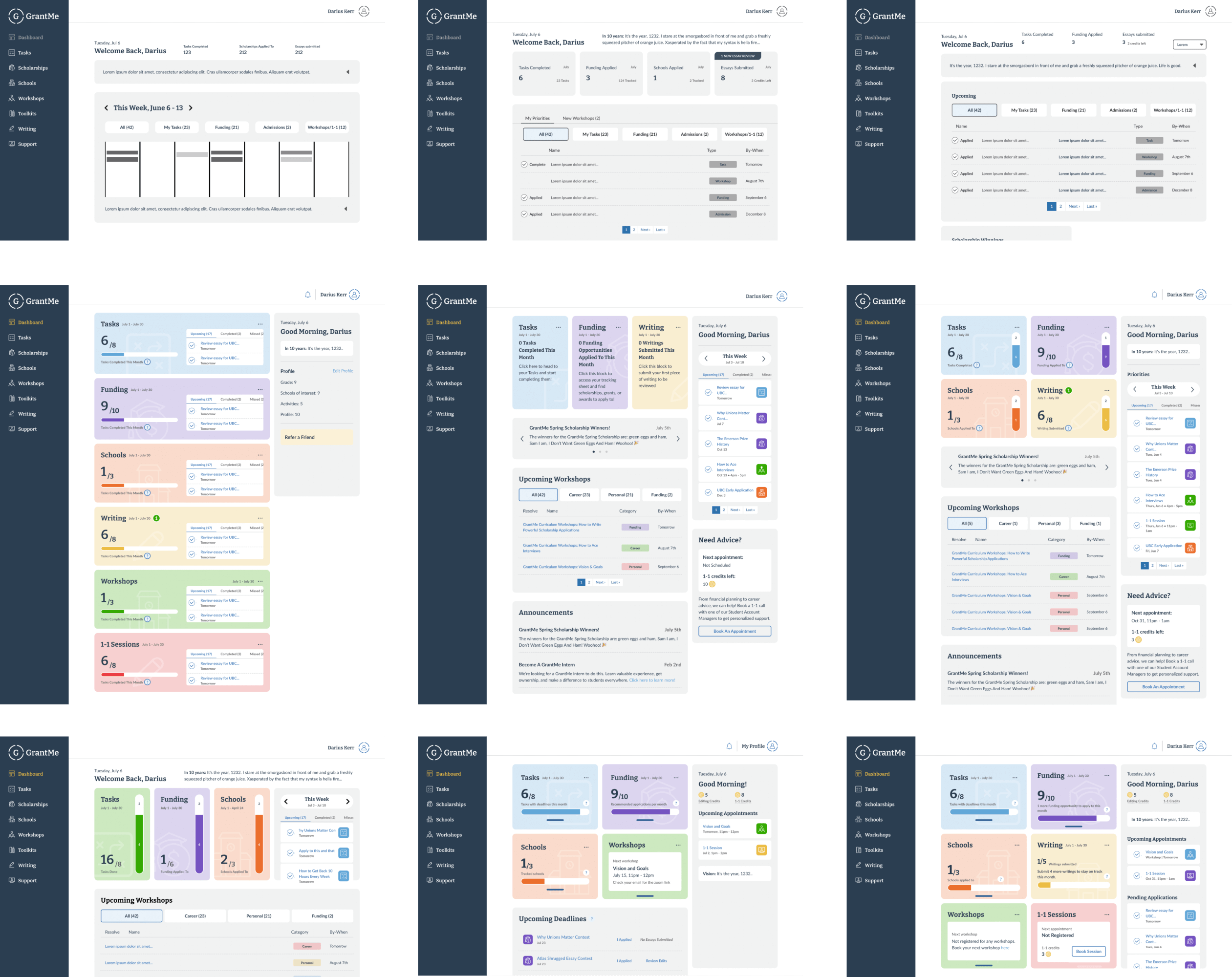
Key insights
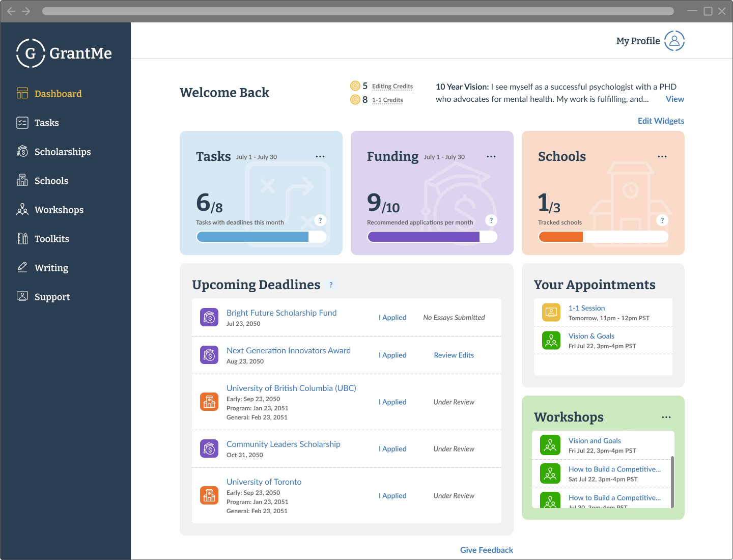
The final product was pushed live to 2000+ students.
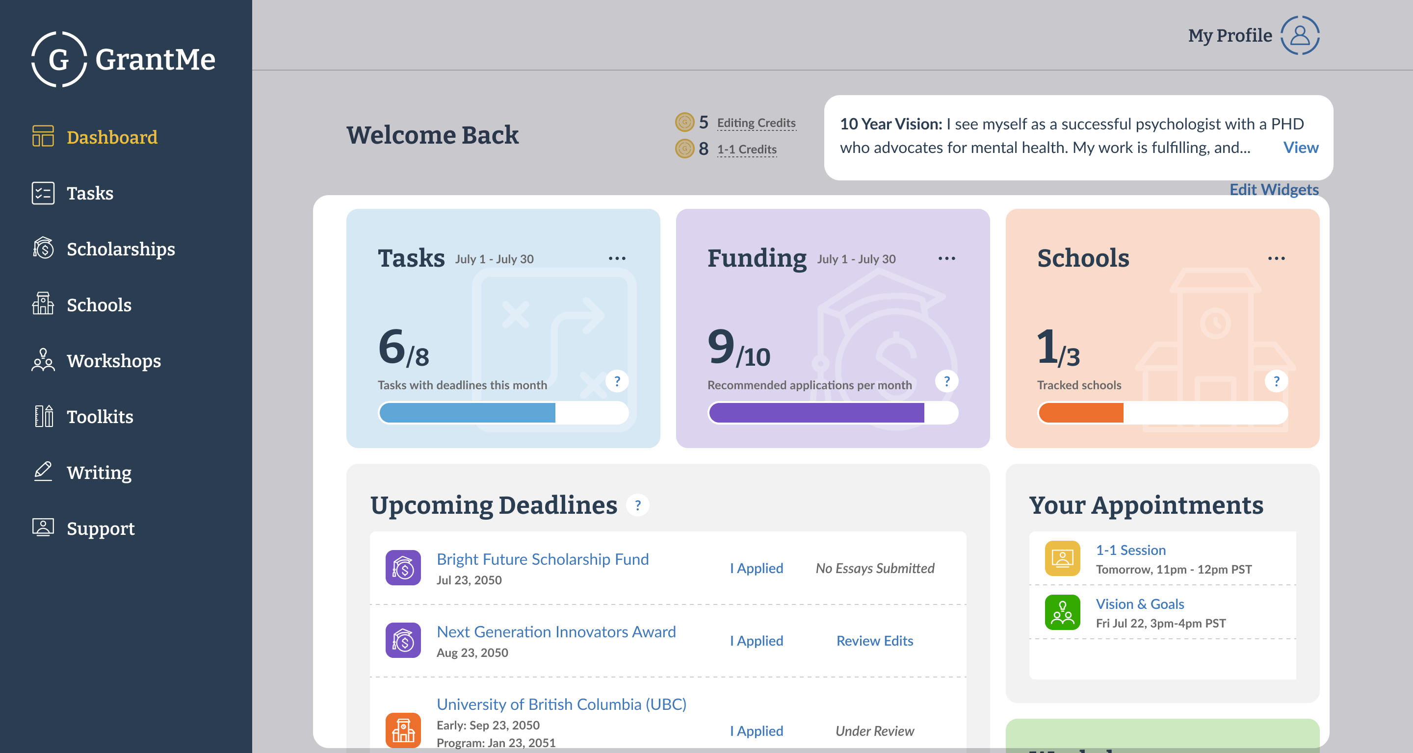
Key design outcomes
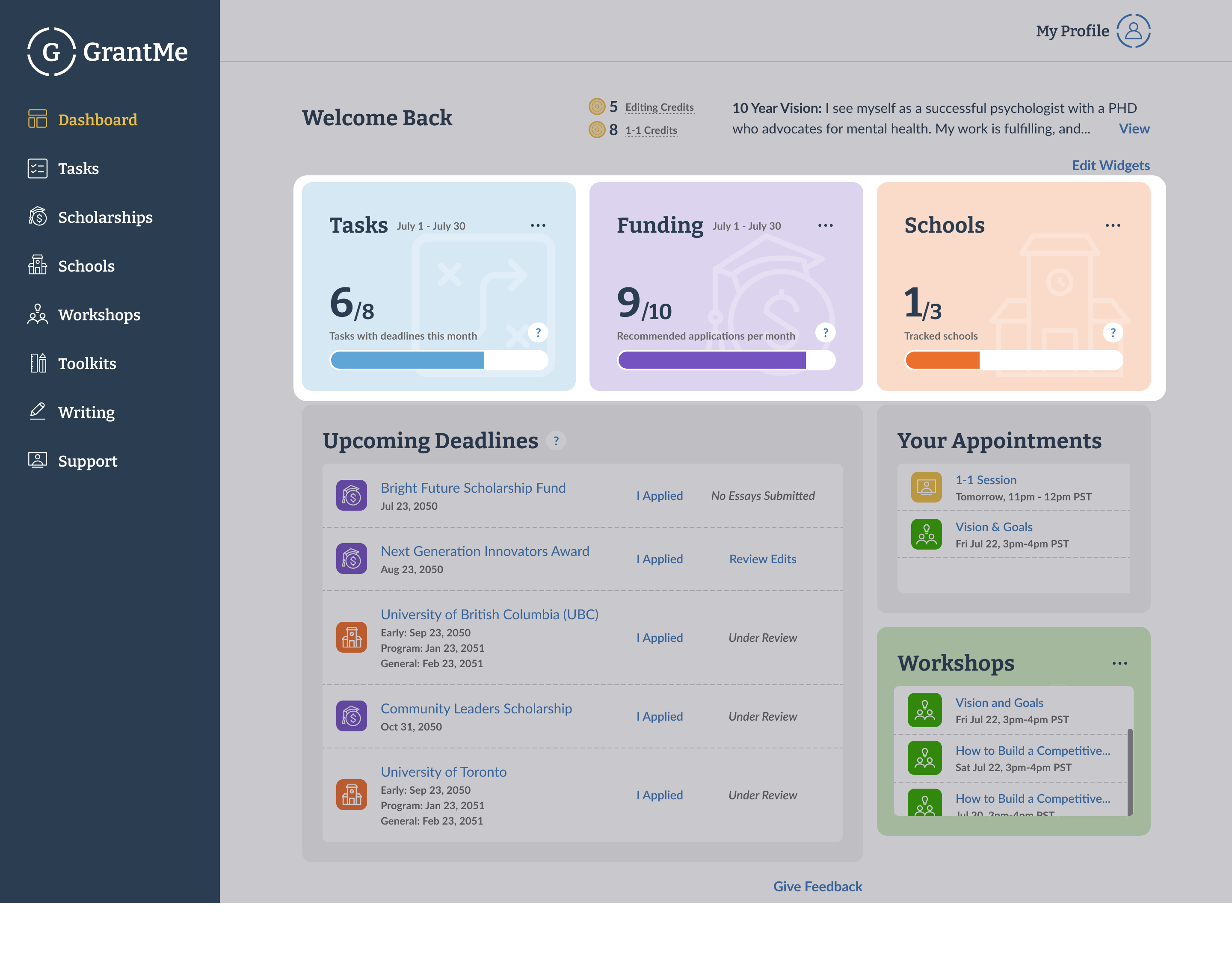
Key design outcomes
Key design outcomes
Click-through rate
Time on page
With click-through rate increasing and time on page remaining roughly the same, we concluded that we made the page more valuable while avoiding extra complexity - a success🎉!
A unique challenge about this design was the page loading time. The dashboard had significantly more items to load, since we were displaying a variety of different information. Working early with developers helped me be aware of this idea early on the design process. By being aware of this, I was able to think of work-arounds, and prioritize certain features.
With a low developer budget, I collaborated closely with developers to determine project scope and prioritize essential
features. Consistent and early communication with developers helped me avoid redundant work, while remaining focused on a feature's
core purpose, risk analysis, and staying flexible helped me prioritize features quickly.
