
Impact
Reduced task completion from 15 to 10 mins (33%) during user testing
Impact
Reduced task completion from 15 to 10 mins (33%) during user testing
Role
Full Time Product Designer
Team
Product Manager, COO, Student Success Manager, Student Success Team (Content Management Team)
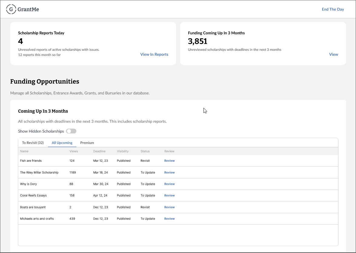
We have over 3,000+ scholarships that our content team keeps updated. These scholarships change their application process every year, and we could not keep up. This resulted in students writing scholarship applications based on old information, which led to negative reviews, poor user experience, and even refunds.
For this problem, we worked with the content team to improve our scholarship updating process.
To drive clarity on what to design for, I discussed with the product manager, COO, and content team manager, on what metric we should monitor.
With the volume of scholarships we had to update, spending 15 minutes per update was too long. With the number of people we had, it would be unfeasible to update all the key scholarships in time.
Our goal was to reduce the task duration of updating one scholarship.
I job-shadowed, conducted interviews, and reviewed screen recordings to understand the Jobs To Be Done to update a scholarship.
Learnings
After drafting a user flow, I could easily and quickly identify where time could be saved.
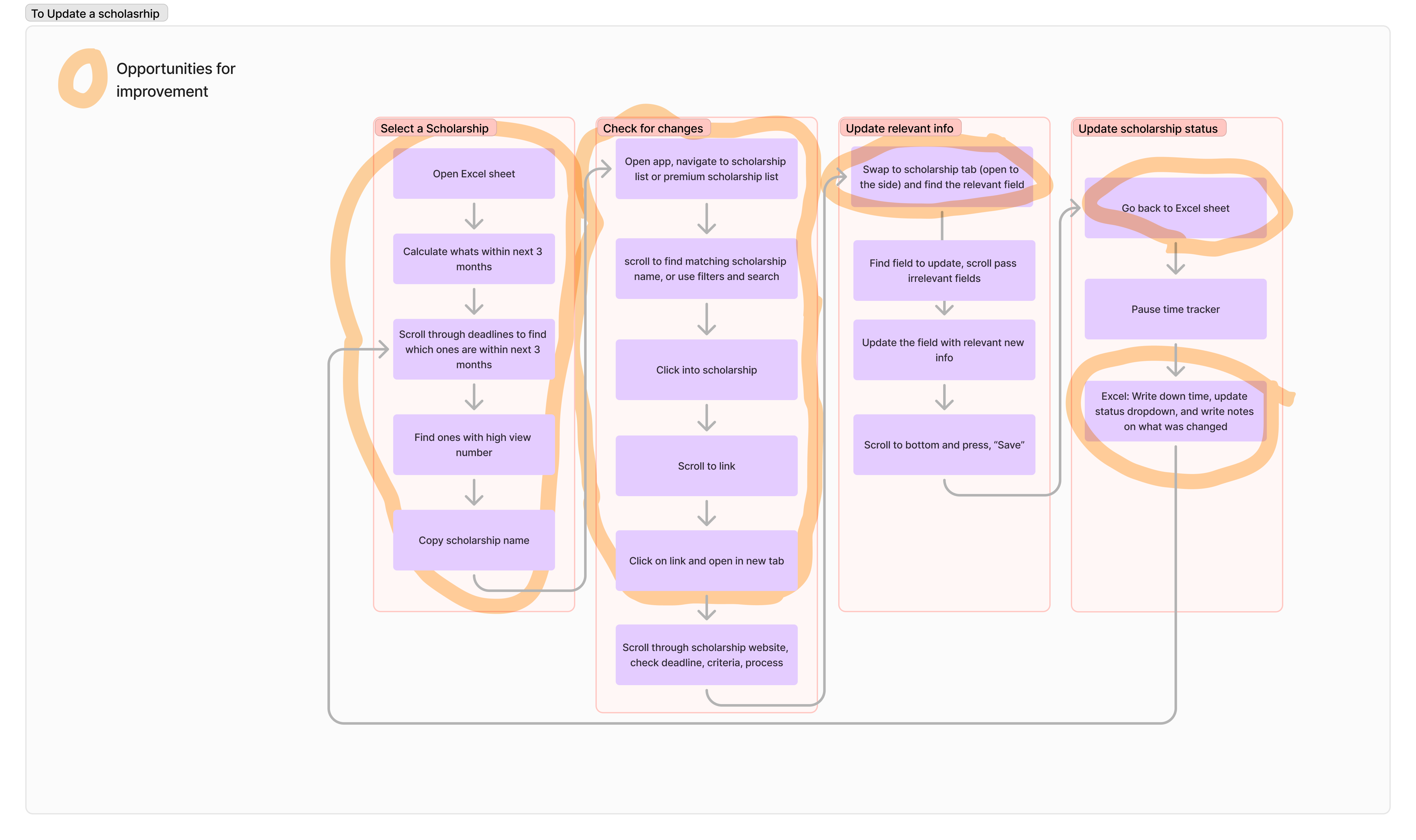
Time was lost to
I presented our findings of the main areas of problems to our CEO, founder, and Product Manager. From this, we gained alignment and feedback, and initiated 2 projects.
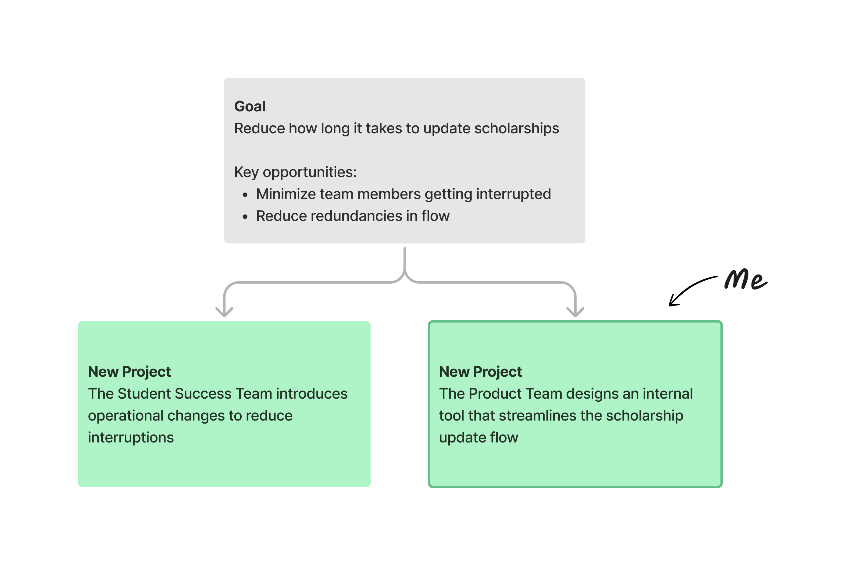
I became responsible for designing an internal tool to streamline the scholarship management process!
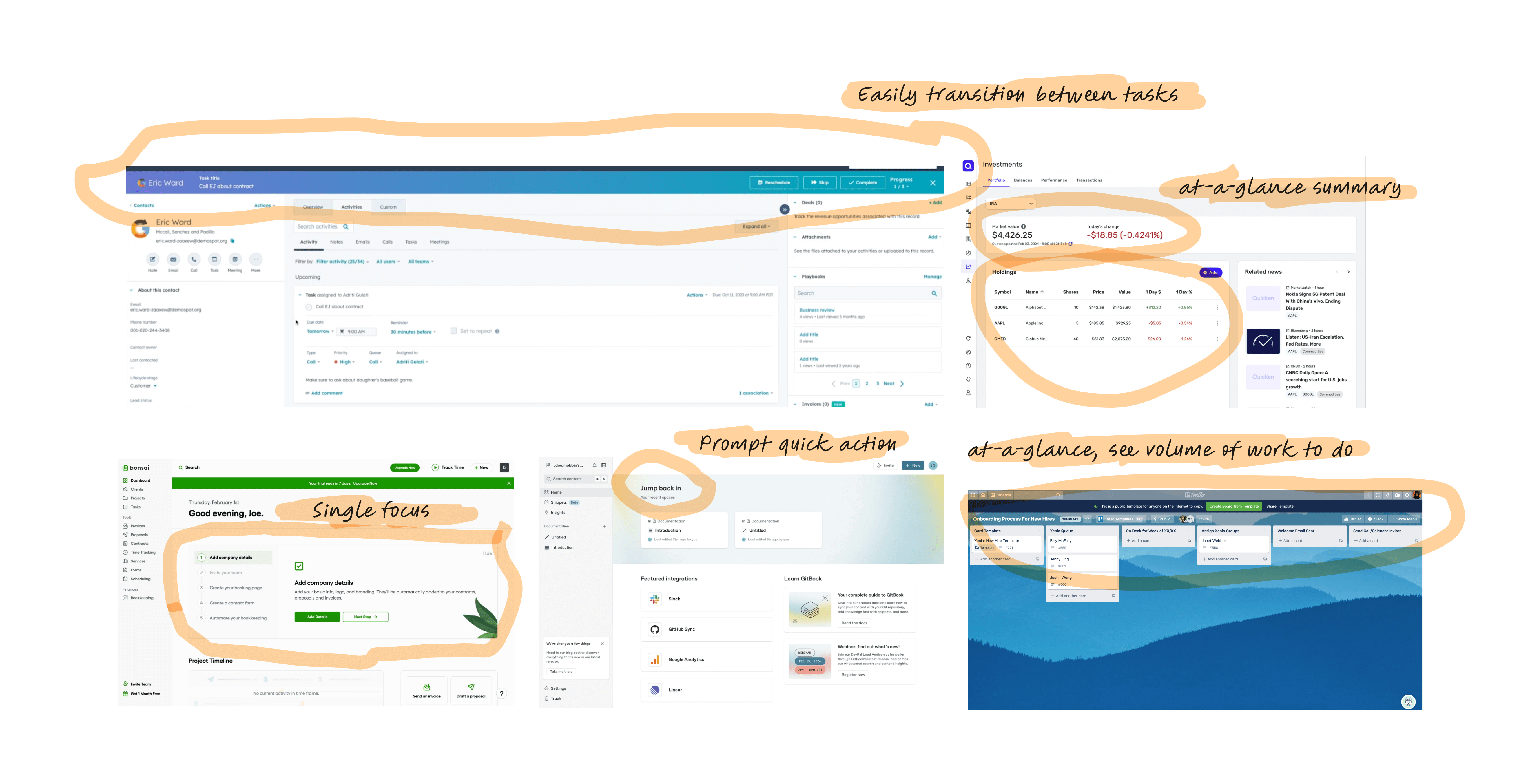
I researched how other tools looked, with special attention to the tools our team already uses to leverage the Consistency and Standards usability heuristic.
Learnings
I worked with my design mentor to create object-diagrams and ideate on how information should be organized.
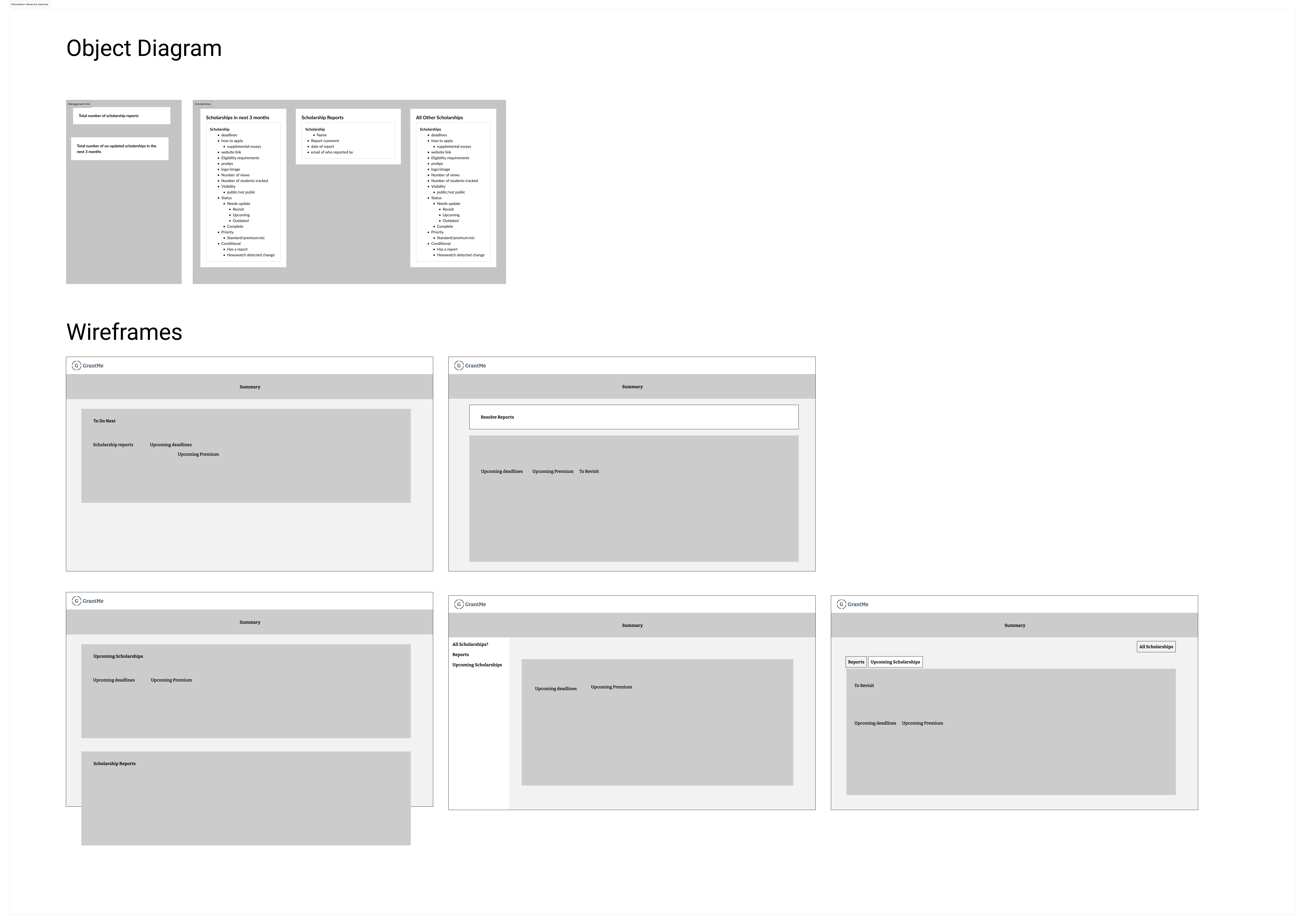
Insights
I worked closely with my product manager and the Student Success content team to ideate and iterate on the design.
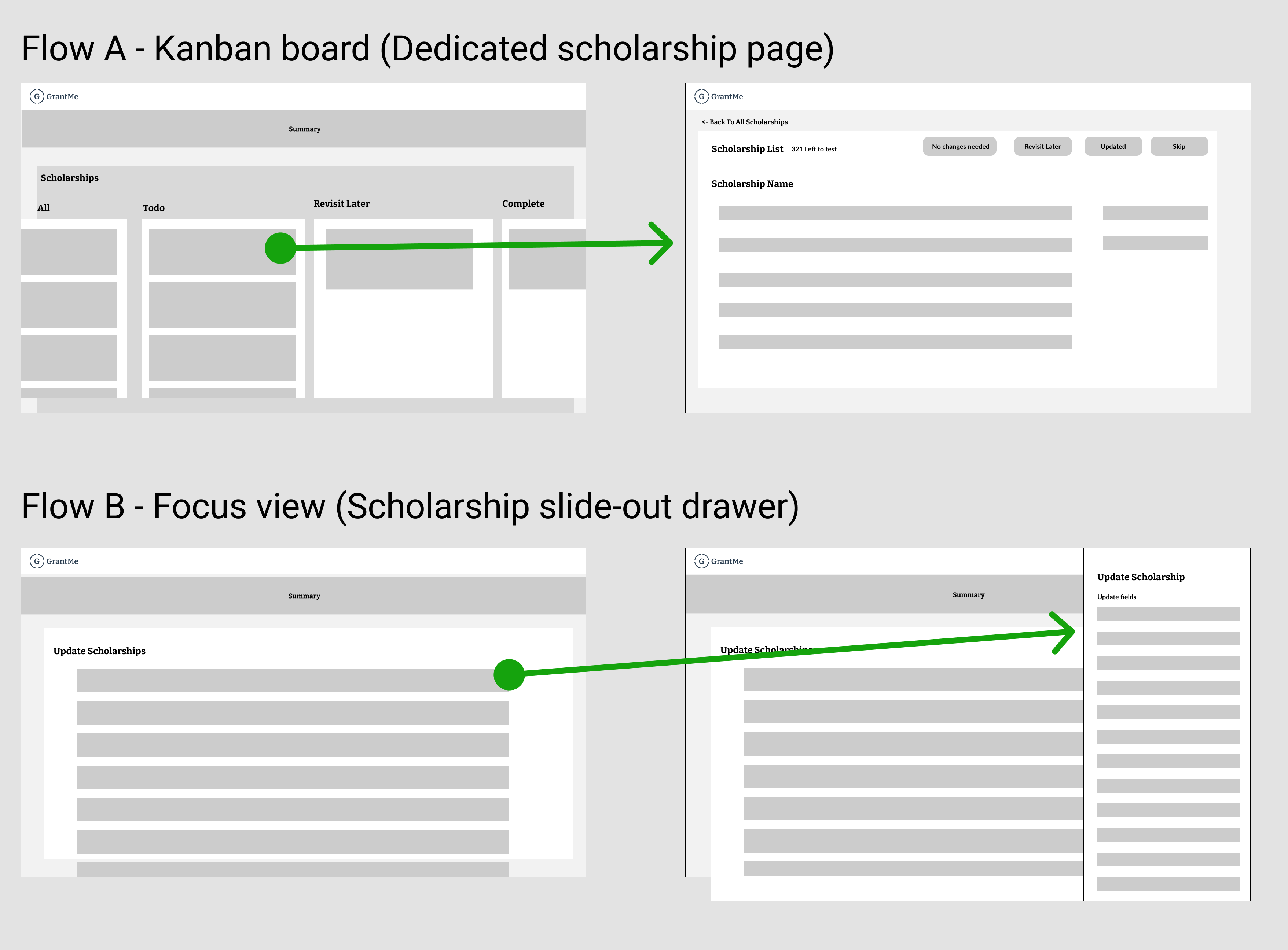
Insights
After determining the flow approach, I added details to the designs for further testing.
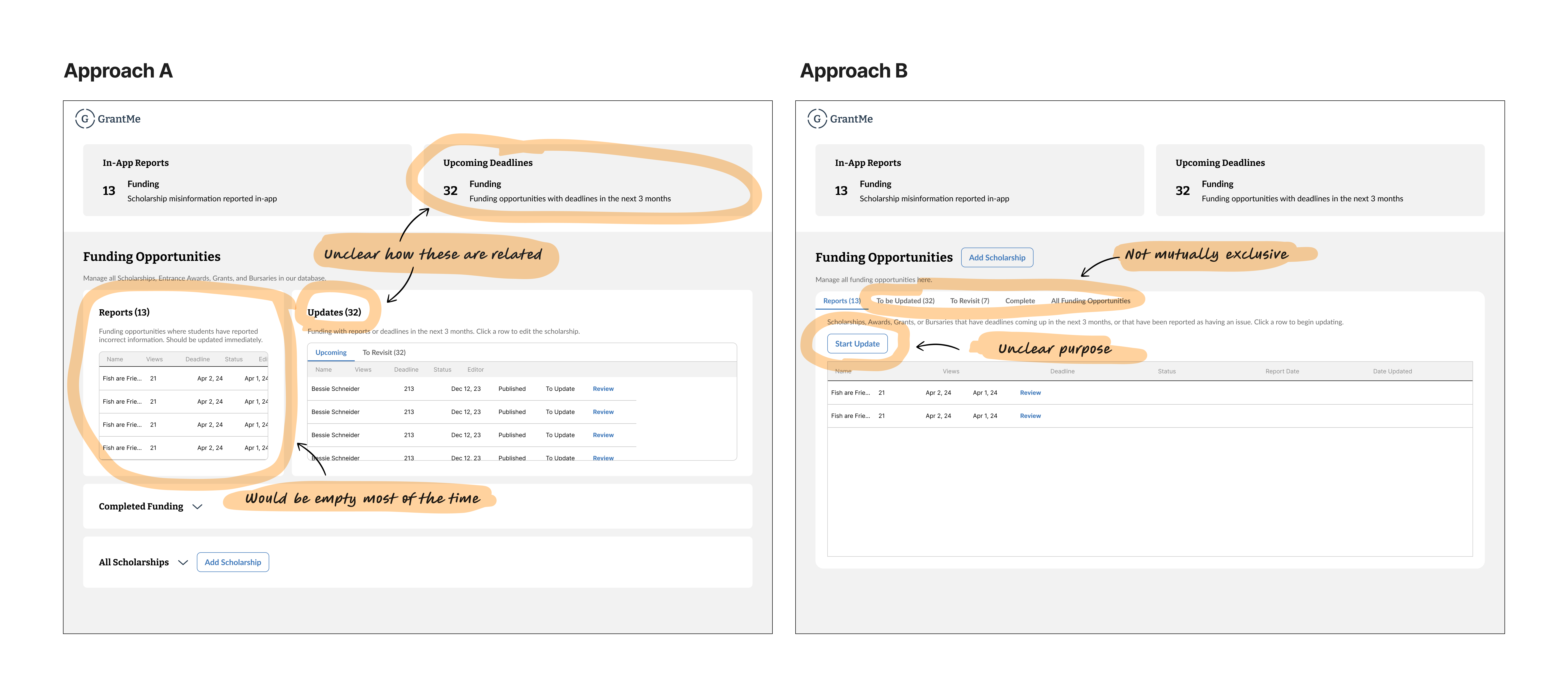
Insights from user testing
I iterated based on the user testing results. I also initiated a design review with my design mentor to get more feedback.
Insights
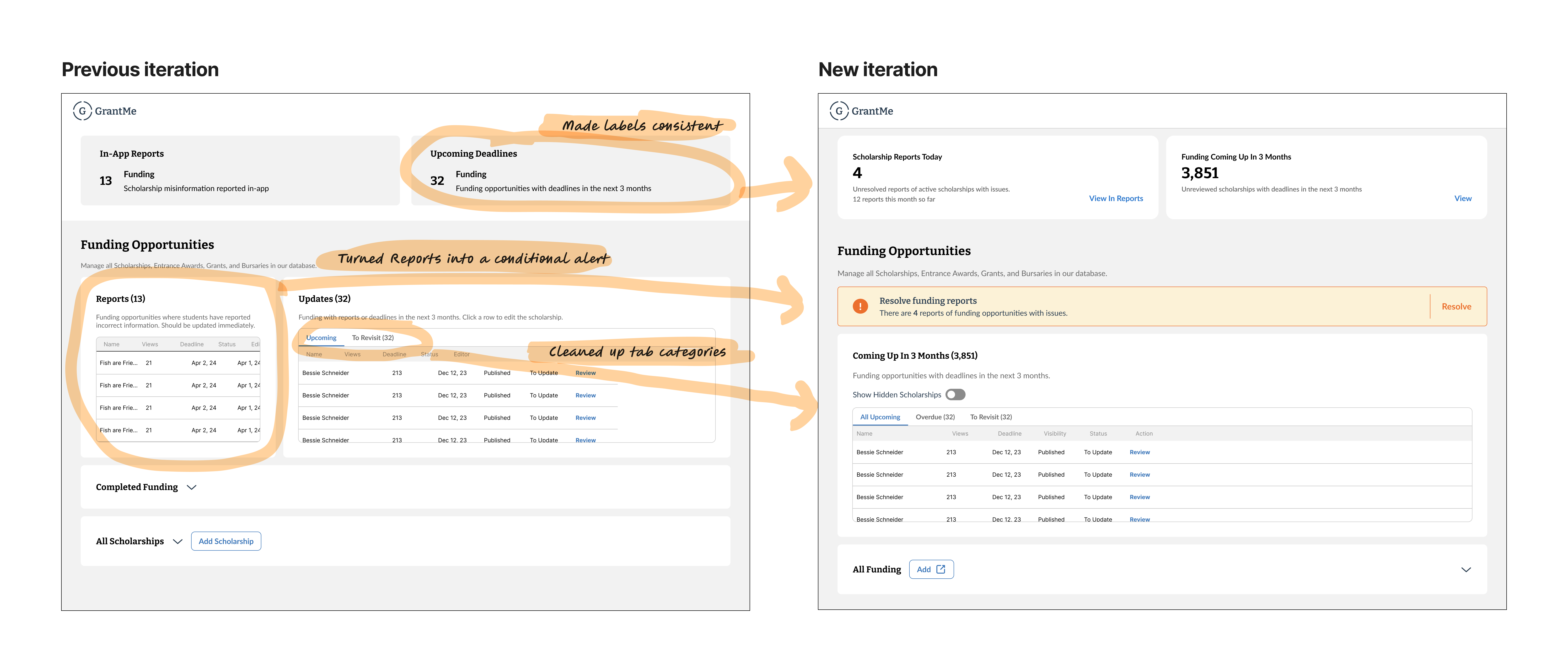
At this point, the Scholarship Report flow was changed. Now, we wanted Scholarship Reports to be secondary to Scholarship Updates, which is not what the current design communicates. I quickly met with the product manager and Student Success team manager to clarify the flow changes and align on what to expect.
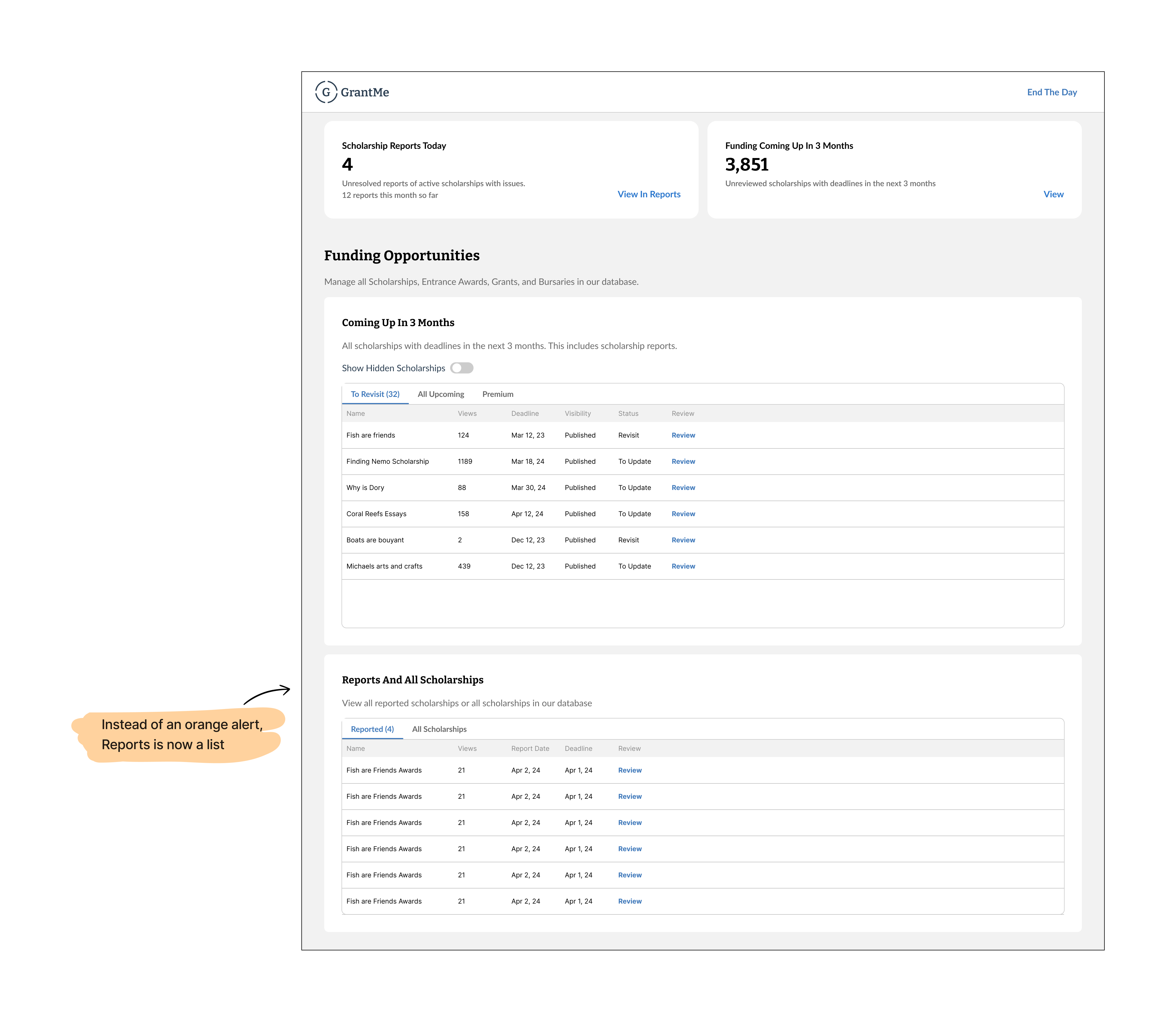
Key changes
From our research, we found that time was lost to identifying scholarships to update, finding the scholarship link, and updating scholarship status. I worked closely with the Student Success Team
to ideate, test, and design what the slide-out flow would look like.
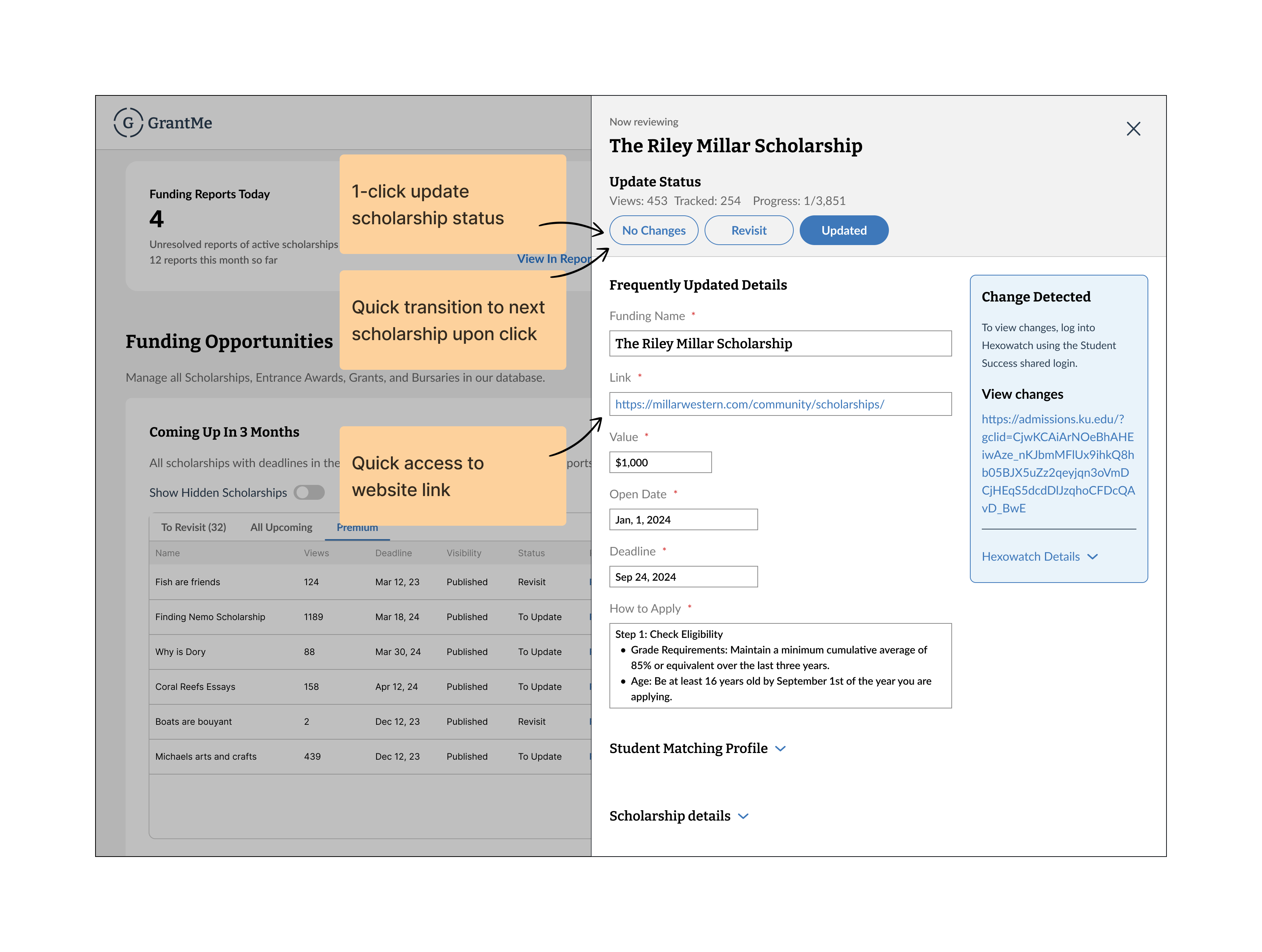
Key design outcomes
Unfortunately, this tool has yet to be built as the company goes through some structural changes. However, during testing with the team, I found the following:
Save 5 minutes per scholarship update
This 33% improvement is significant, especially given that we have approximately 3,000 scholarships that need to be updated every month. This 5 minutes saved per scholarship amounts to 250 hours saved a month!
With our users being teammates within the same office, it was a lot easier to collaborate with them. However I still needed to be mindful about using their time intentionally. Thus, opportunities to design more efficiently included being able to use lo-fi designs to iterate, and being able to job shadow easily. Identifying these opportunities helped me design a solution more quickly, and also build buy-in as the team was very involved in the process.
The flow for a key action was changed mid-way through the project. Despite that, What helped this transition go smoothly
without adding too much time to the project was the swift communication with the manager on exactly what was changed. During this conversation, I asked questions to clarify exactly
what was changed and what wasn't. From there, in conjunction with the information-hierarchy work we did earlier, I was able to easily adjust the changed flow without having to change
any other part of the design.
