Impact
87% completion rate
Impact
87% completion rate
Role
UX Design Intern
Team
Developers, CEO/Founders, Design Advisor
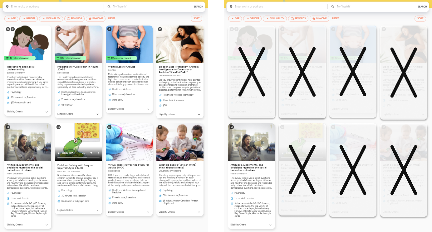
Honeybee is a platform that connects people to research studies. But, people have difficulty finding research studies that they can actually take.
As Honeybee’s sole UX Designer, I was responsible for figuring out why there was difficulty. Then, through collaboration and research, I would design an optimal solution to address this.
From a recent survey on user experience, we found that 30% of our users were unsatisfied with our website. 49% of these unsatisfied users had difficulty finding research studies
What makes research studies hard to find for the browsing experience?
Insights
I visited other platforms that offered health, research, or entertainment content to see how they offered personalized services.

Insights
Honeybee is unique in that we not only need personal interest information, but also demographic information to filter out research studies.
I looked at existing studies from other sources to see what criteria was often used to determine eligibility.
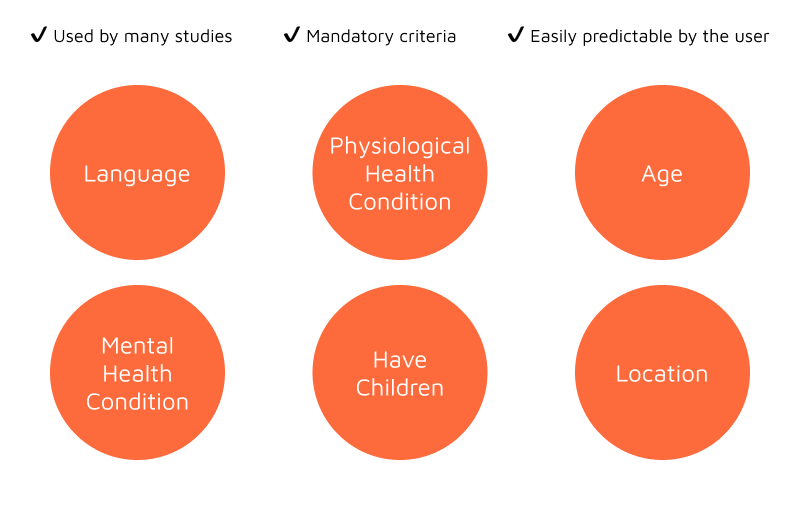
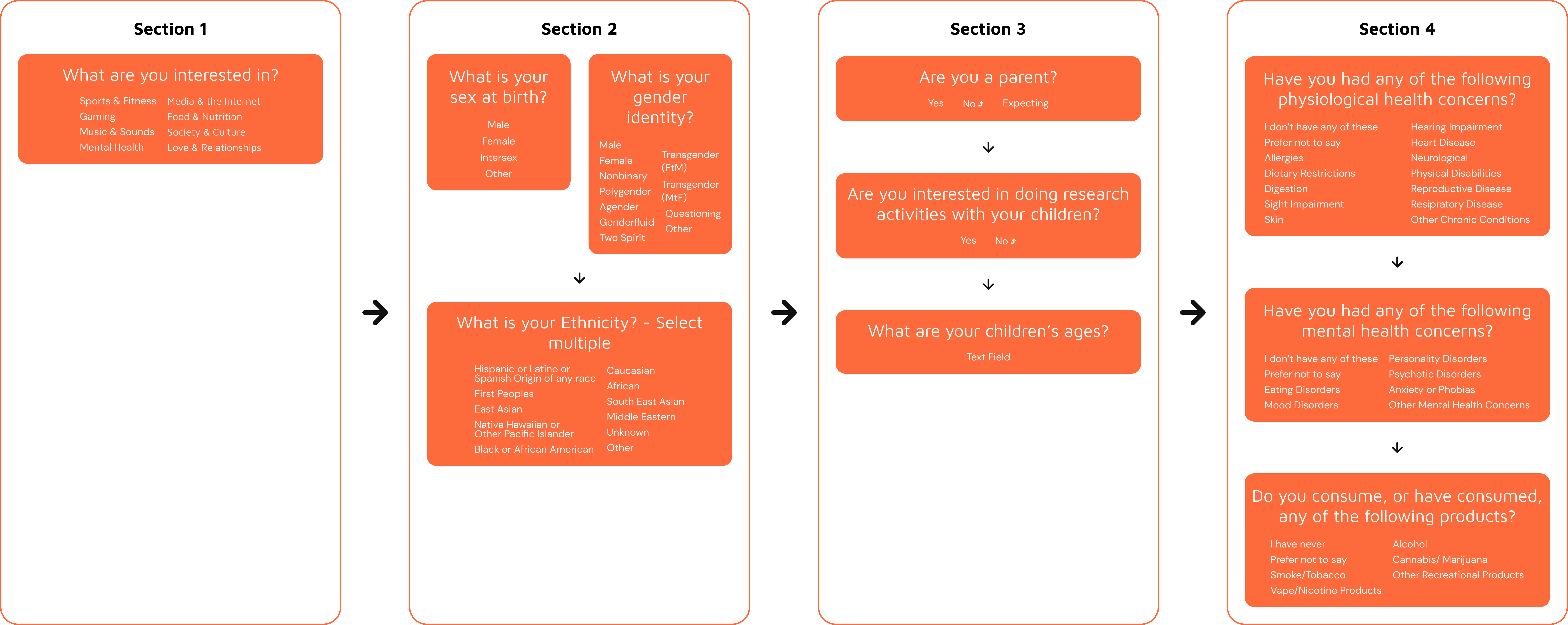
I drafted the questions based on these criteria into a question flow

Since the questions are multiple choice, I needed to figure out all answer options for each question. I had 2 main considerations.
I then conducted research online for adequate answer options and added these to the flow.
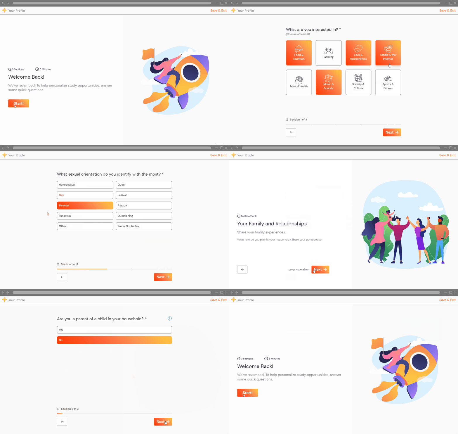
Because our target audience is extrinsically motivated, I decided on the following design principles.

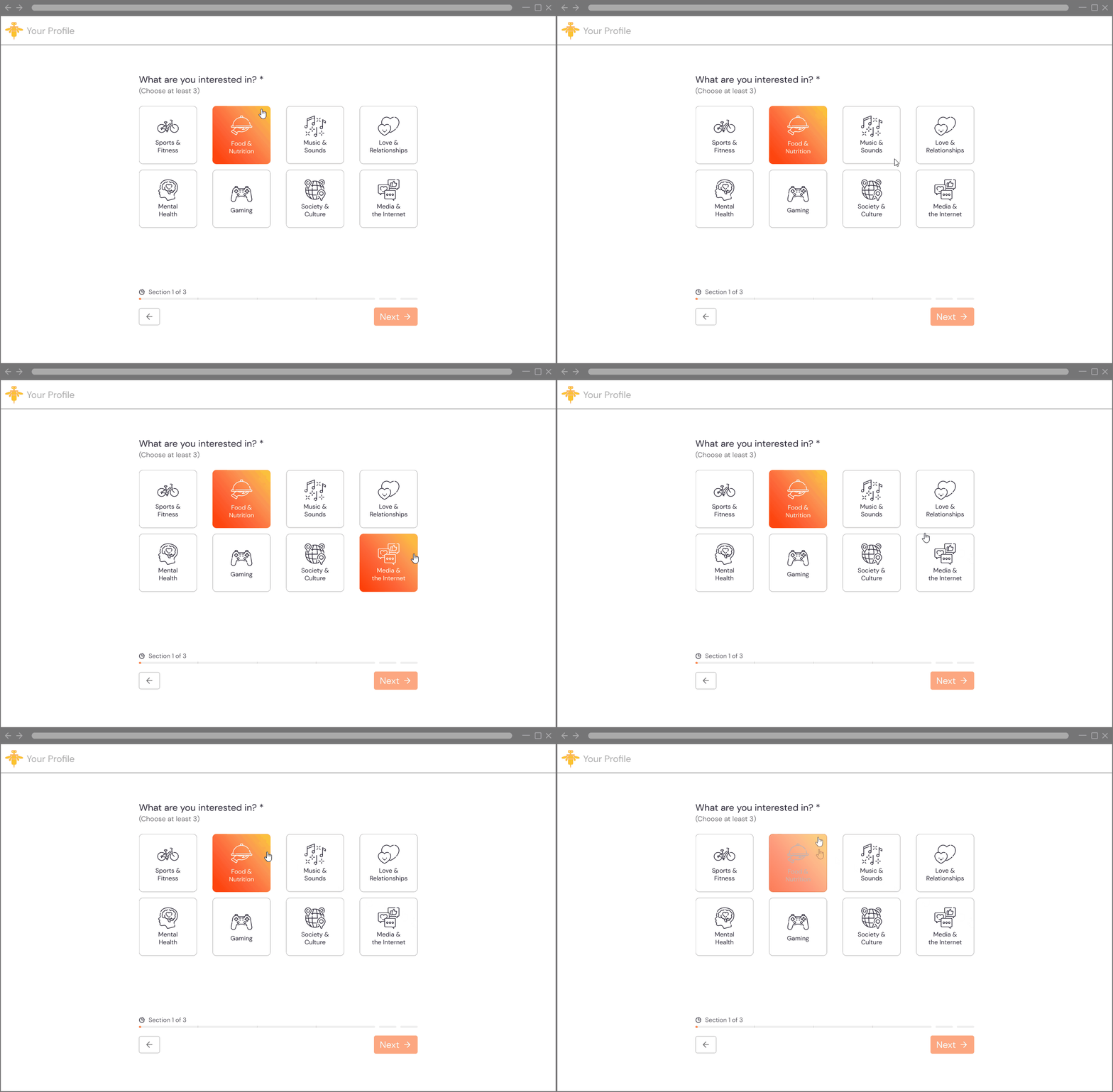
The objective
How can we encourage users to select more options and not rush through this question?
Key design outcomes
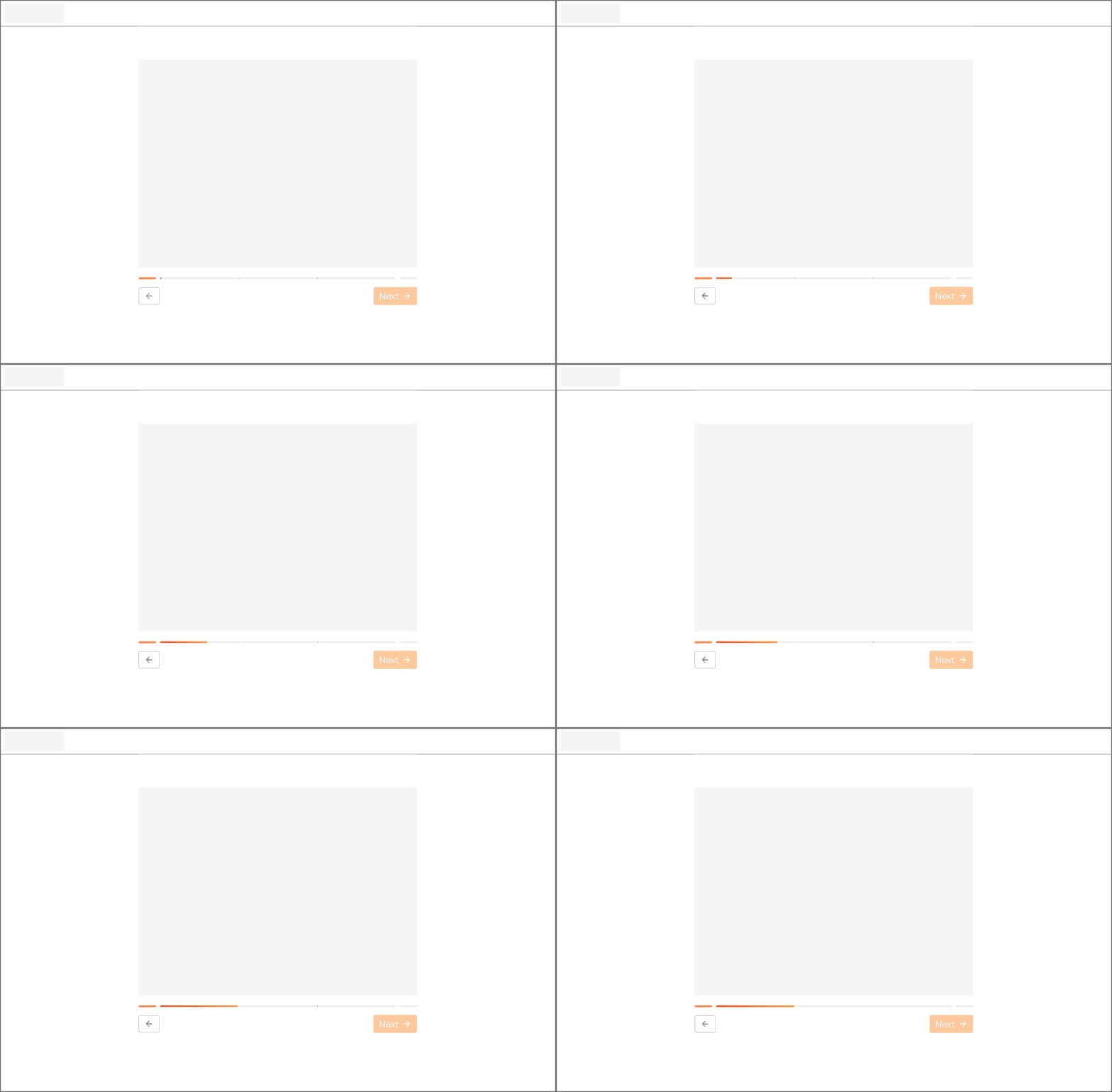
The objective
How can we accurately keep track of progress, what's to come, and capitalize on the feeling of progress?
Key design outcomes
Completion rate
Profiles with collected data
How could we design a profile builder that felt inclusive and usable for everyone? This was one of the major challenges of this project. Making the questions non-ambiguous, the answer options inclusive, and thinking about the connotations of visual indicators across different cultures. This is just a small set of the many different things I learned about when designing with inclusivity in mind. A challenging but necessary goal to have!
I believe a profile builder has a lot of opportunities to be fun and exciting. Moving forward, I’d love to design a similar profile builder that draws on the elements of character building in many games. In other words, how could we gamify a profile builder?
This could be done simply through the progress indicator. Making a lightbulb light up, a flower bloom, or a slime blob grow into a personalized slime. The possibilities are endless!