
Outcome
2nd place @ IBM CSC318 Student Design Competition
Outcome
2nd place @ IBM CSC318 Student Design Competition
Role
UX Designer
Type
School project
Team
UX designers, Researchers, Design advisor
Fact-checking information we see on social media is often inconvenient, leading to my peers and I consuming information on social media with no consideration for its validity. How do we know if the information we consume is reputable or misinformed?
Within a group of 5 designers, I conducted in-person interviews, contributed to both lo-fi and hi-fi prototypes, tested and iterated on our final app design, and presented our designs within a design competition.
I conducted an online survey with over 200+ participants and we found that a majority of students or early career adults in their early to mid 20s are affected by this problem.
Participants that were fooled by fake news
Participants use social media as their primary source
At least 57% of participants have reported that they believed something was true, but later found out was false (fake news). To note, most of these people also use social media as their primary source for information.
Given our limited research timeline, we looked to published research papers and confirmed our results.
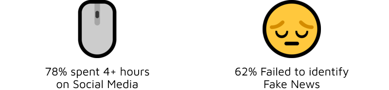
From a published research paper with over 400+ participants, we confirmed that misinformation is an ongoing problem that starts at identification - 62% of people are unable to identify if information is not reputable.
I interviewed 5 audience members to understand their perspective, but given the previous research on how this group misidentifies fake news, we also looked to experts. We consulted my university research professors on how to critically evaluate information.
Insights
We were worried about adoption. From my user interviews, we knew that our audience already has an established flow. Our solution would need to fit seamlessly into that.

Insights
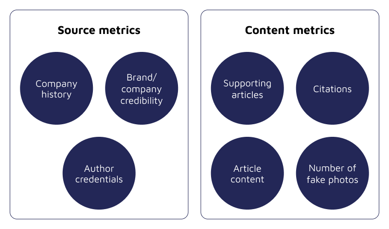
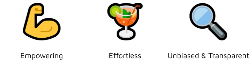
From our findings, we decided on the following design principles.
The final product and design process was presented to a panel of IBM design experts and fellow contestants. Our product achieved 2nd place in the design competition.
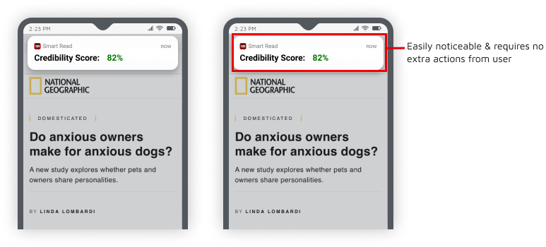
From a number of solution options, we tested the notification approach as it seemed most feasible for development.
Testing Insights
Key Design Decisions
Testing Insights
Key Design Decisions
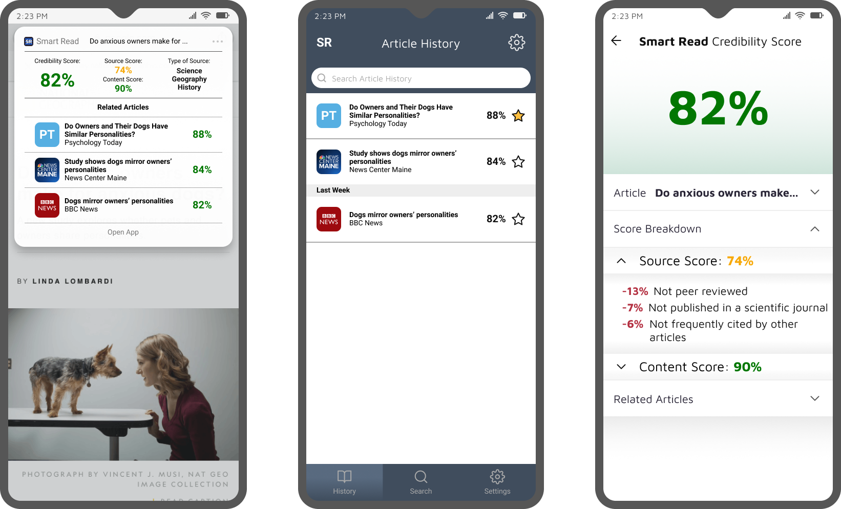
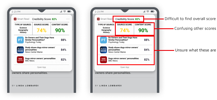
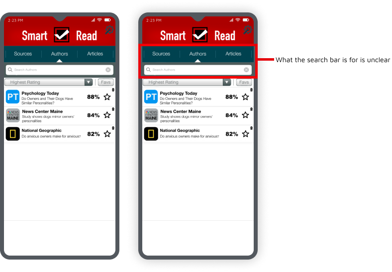
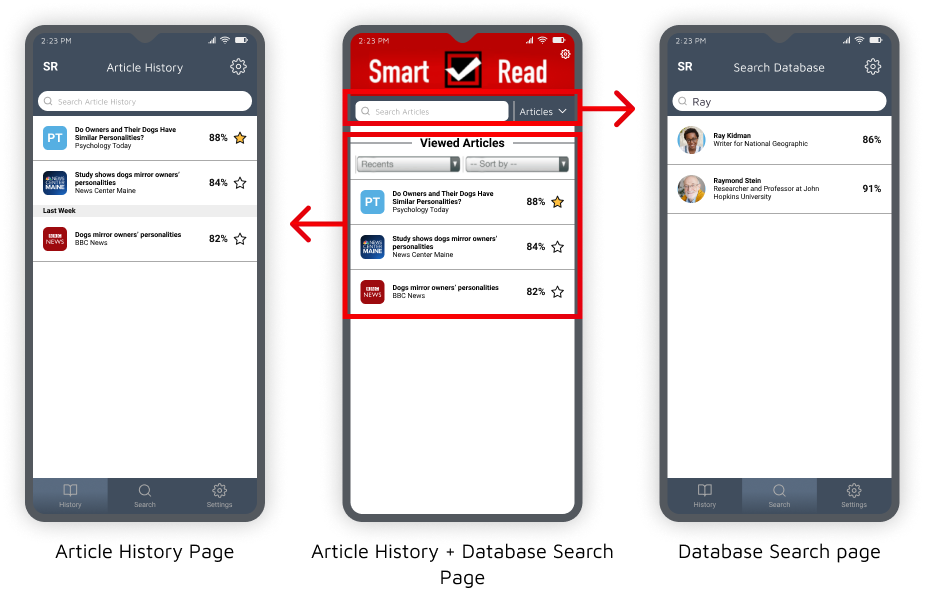
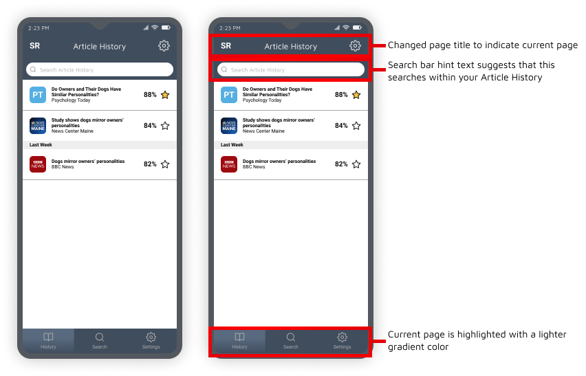
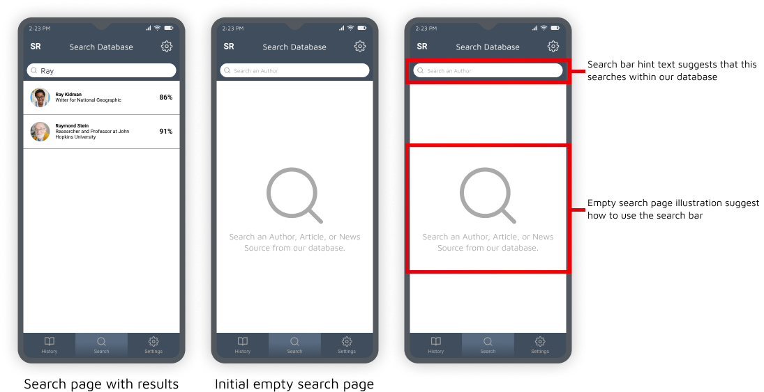
Our app had two main features: searching for articles, or, browsing your history of articles. Through user testing we found that students were repeatedly having problems finding where to complete these tasks.
Testing Insights
Key Design Decisions
Key Design Decisions
Key Design Decisions
This project was presented in front of a panel of IBM design experts, and placed second!
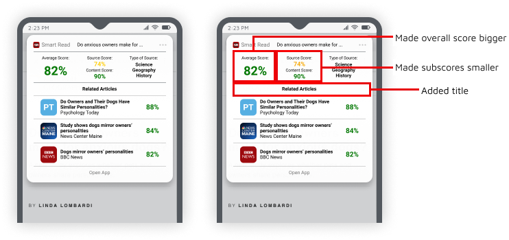
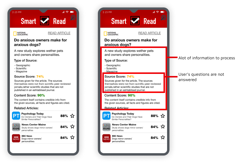
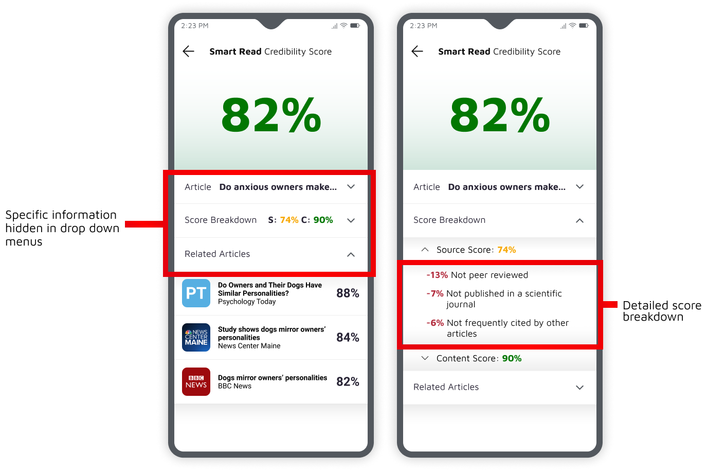
How to present an abundance of information without overwhelming our users? Our credibility report had a lot of information that needed to be presented. Leveraging progressive disclosure elements and prioritizing information according to our users' needs were all very important aspects of this challenge.
Going forward, I'd love to consider other target audiences of interest. In this project, we targeted young adults in their early 20s. However, I wonder how this may be changed for older adults? There is a lot of potential to expand this project, especially when considering how we can best make an impact on fake news as well.
Edit (Dec 2022):
Now with AI becoming much more accessible as a content generator, how would a misinformation app scale to address AI applications?