

Problem context
People don't know what's real and what is fake
SmartRead is an app that helps you identify how credible an article is.
Problem scope
Most young adults can't identify fake news
I conducted an online survey with over 200+ participants. Participants were mostly university students and early-career adults. Other research studies supported our results.
At least 57% of participants were previously fooled by fake news.
89% of participants use social media to get news
Solution system
Credibility depends on multiple factors
I conducted interviews with students and took learnings from university professors to understand how to measure the credibility of an article.
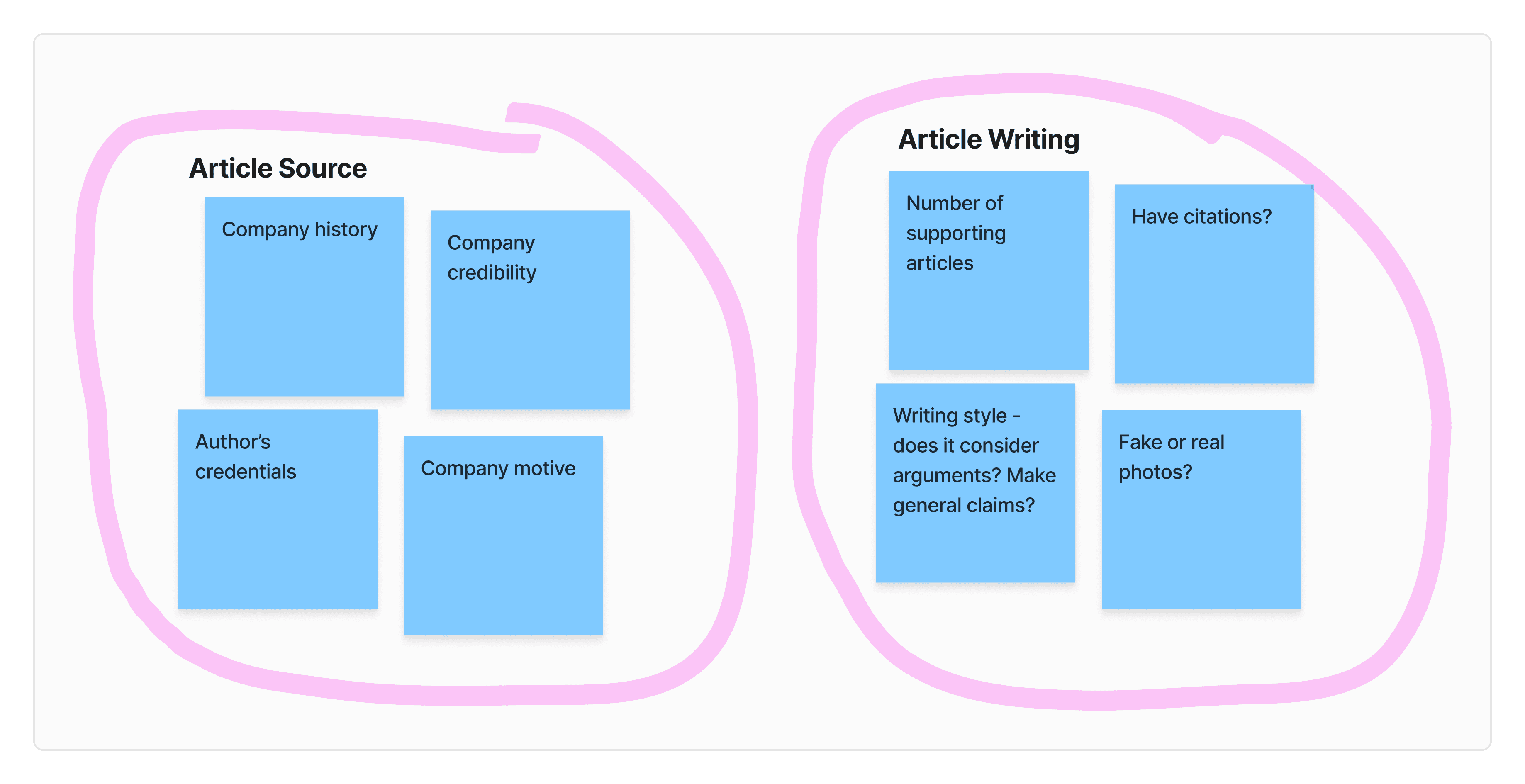
Methods of how to measure article crediblity

Insights
There are many things to consider to measure article crediblity
Consider the source of the article and how the article is written
Research
Making the solution convenient
One of the reasons users don't check their articles is because it's inconvenient to do credibility research. We wanted our app to be very convenient, so we created a user flow based on our audience's behaviour.

A flow diagram of a user opening an article from Social Media
Insights
People don't read everything
This flow already has many steps
Design
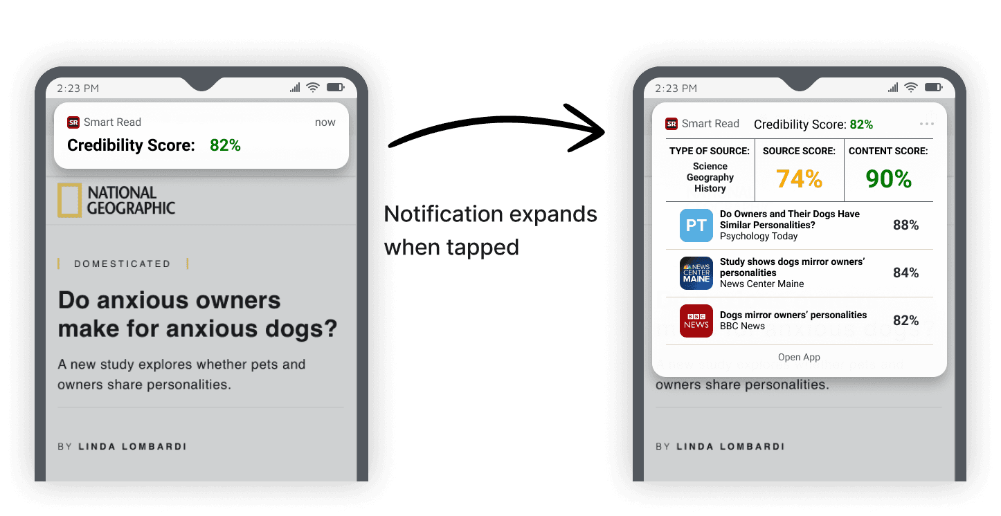
Using notifications for seamless transitions
From a number of solution options, we tested the notification approach as it seemed most feasible for development.
Insights
By using a notification, users avoid making extra actions to get the credibility
Testing insights
Test prototype
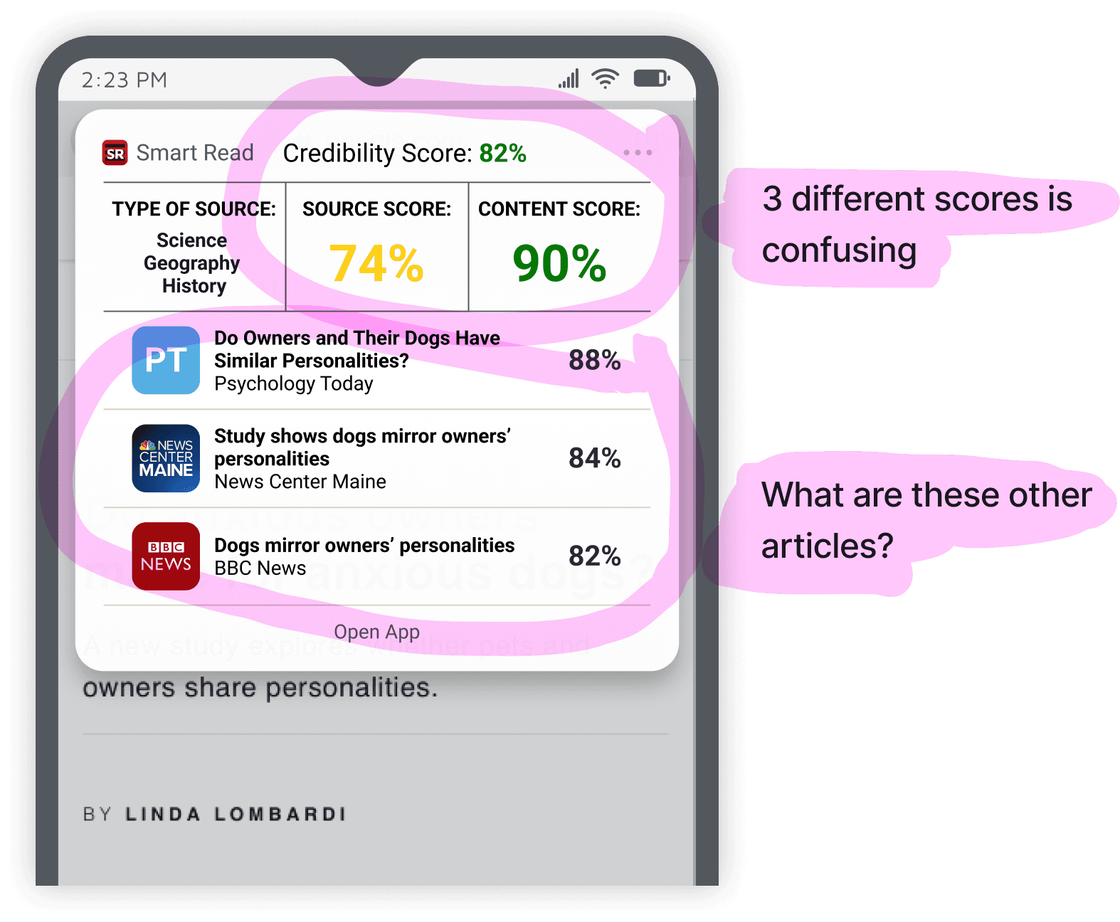
Visual hierarchy of the different scores was confusing
Random list of articles have no context on how to use them
Final iteration

General score bigger, sub scores smaller
Added a title for Related Articles
Design
Avoiding information overload
I assisted in design changes based on our testing results.
Test prototype

Paragraphs of text made people feel overwhelmed and reluctant to engage with the content
People were curious how the scores were calculated
Final iteration
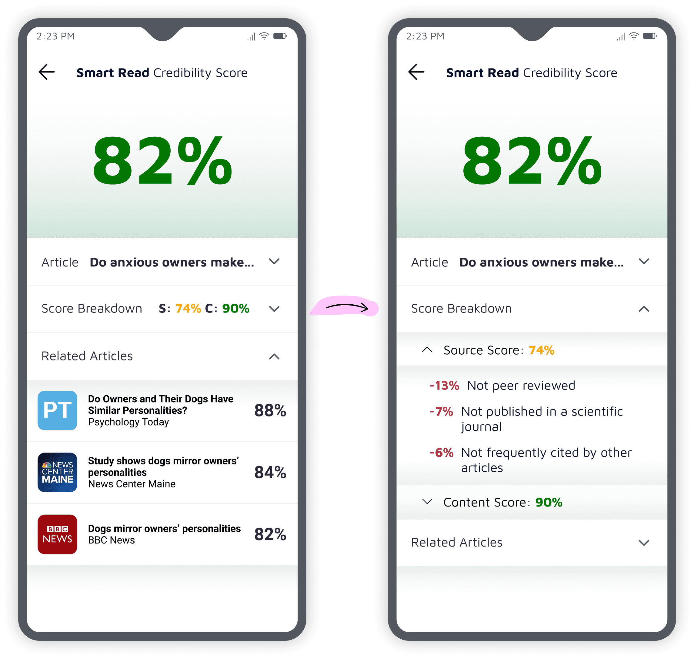
Stronger visual hierarchy, general score is bigger
Sub-score details hidden in dropdown
Added detailed score breakdown calculations
Design
The app home page was very confusing
During testing, I unearthed that many were confusing.
Test prototype
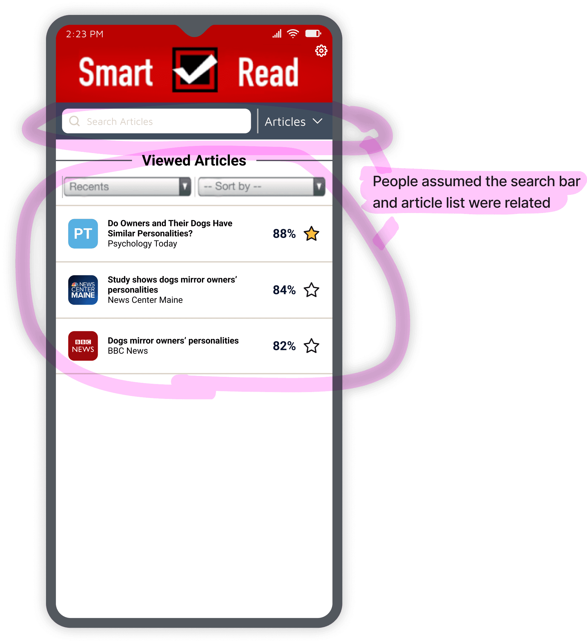
The two features were on the same page, leading to confusion because they seemed connected but behaved differently.
Final iteration

Moved each feature to its own page and added bottom navigation to make their separation clear.
Results
2nd place at a competition judged by IBM experts
This app design earned 2nd place at a student UX design competition against 12 other teams. The competition was judged by design experts from IBM and had many industry professionals mentor and test designs, including designers from major banks such as CIBC.
Placed 2nd among 12 groups
Presented designs and app to a panel of 4 IBM design experts
Bonus: My first formal introduction to UX design. This project kick-started my path into product and UX design.


