Impact
Increased revenue by 100%

Impact
Increased revenue by 100%
Role
UX Design Intern
Team
Developers, Engineering manager, CEO and founders
Our current pricing model is optimized for small-sized research labs. How can we introduce a better pricing model optimized for larger organizations?
Both customer emails and our CEO suggested a subscription pricing model. I was responsible for implementing this in a way that addresses the core issues that led to these suggestions.
Since we couldn't conduct research or testing due to our limited resources, I looked to other website examples to gain design insight.

Insights


The objective
How do we help our users navigate a complex series of choices?
Key design outcomes
The objective
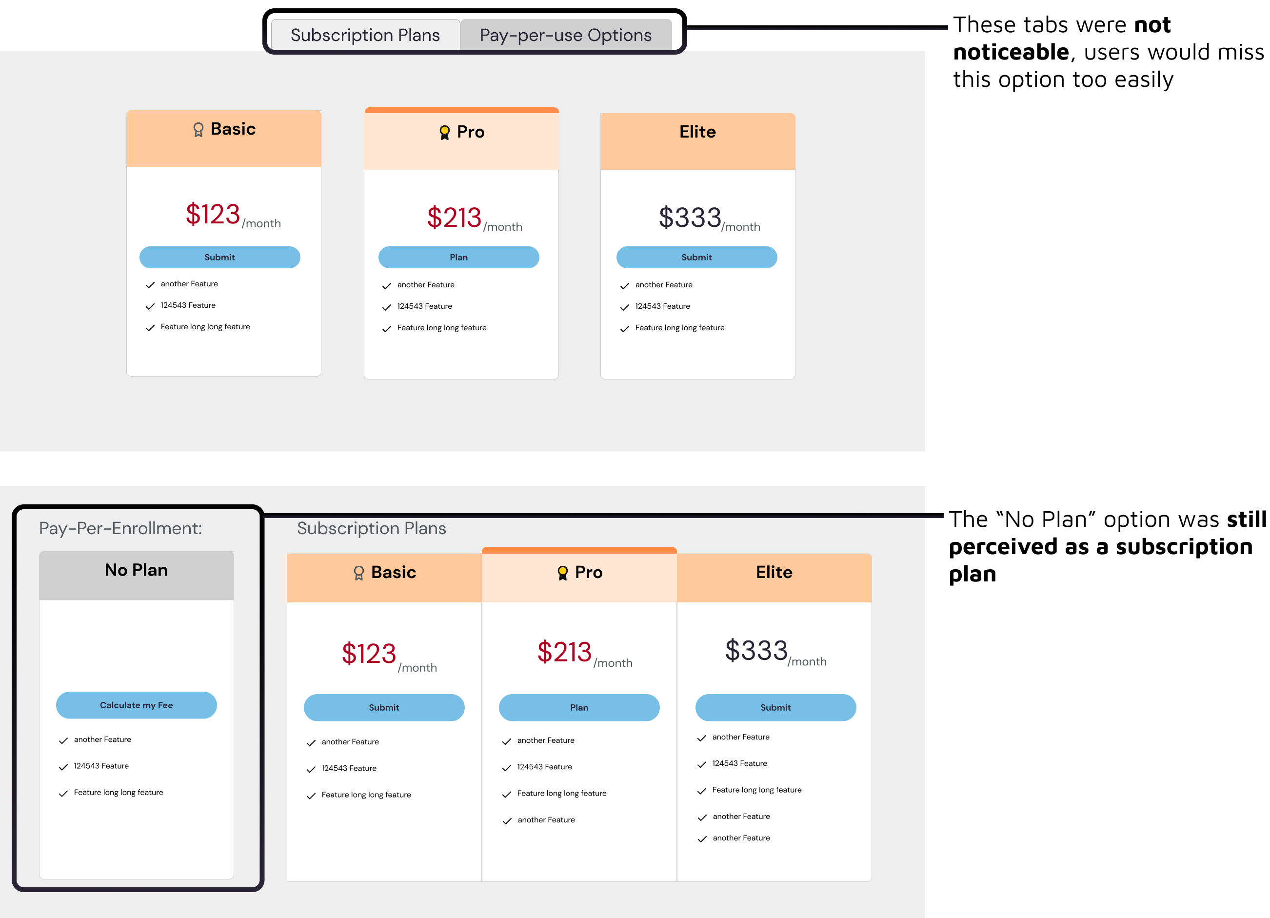
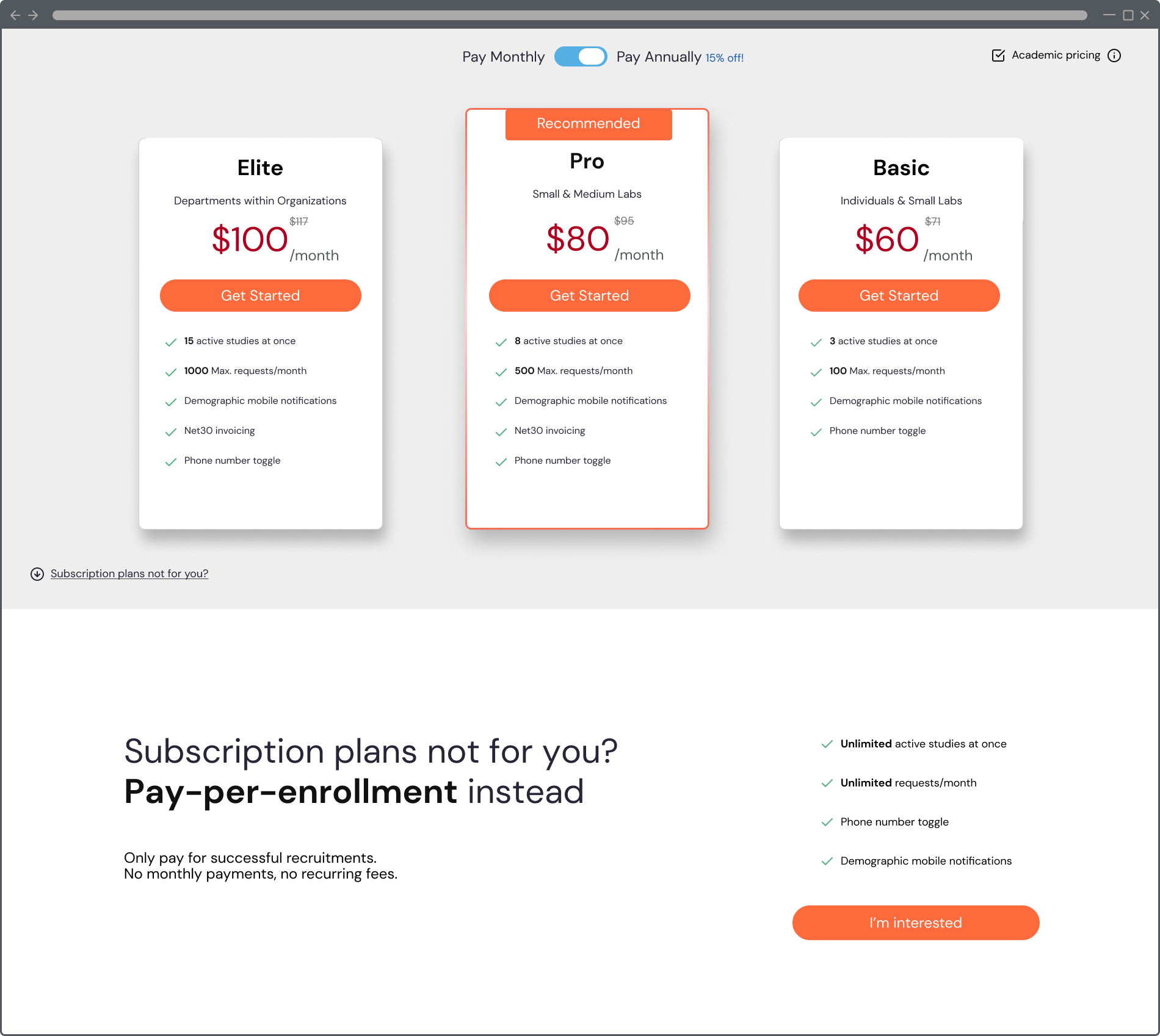
We wanted to keep our pay-per-study system available for our small-sized labs. How can we convey that we have both subscription and non-subscription payment options?

Feedback Insights

Key design outcomes
Stabilized & Increased Monthly Revenue by 100%
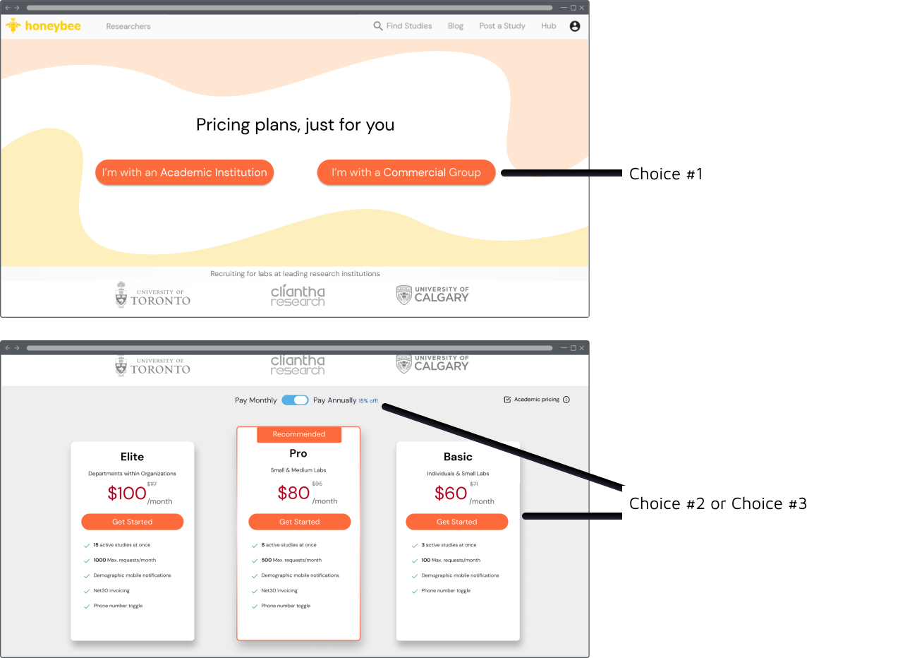
An interesting challenge was posed by our complex pricing system. Not only did we have different pricing for different types of organizations, but we offered different discounts for different payment methods as well. This resulted in a complex array of choices that the user had to make. Keeping in mind which choices could be made easily, which ones should be asked first, and asking myself which pieces of information was needed when asking certain questions, helped me determine where, when, and how to structure our pricing page questions.
Since designing this project, I recently came across an article discussing the worries a user may have when deciding to purchase a product. This includes: if the product is a right fit in terms of cost, time, effort, and content. I did not address all of these worries in this page. Looking forward, I'd love to at least add an FAQ to help address some of these worries. As well, if I had done a simple survey beforehand, I may have also been able to elucidate these questions as well.